Maximizing Every Inch of a Harrisburg, PA
Small Apartment Kitchen
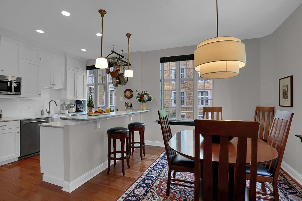
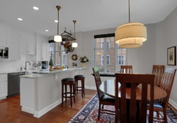
BEFORE AND AFTER: Downsizing a home can be challenging not only because of the accumulation of “stuff” that must be reduced, but also because it can be a challenge to fit all of the “must haves” in a much smaller space. A Harrisburg couple in a historic apartment building overlooking the Susquehanna River engaged Mother Hubbard’s to transform their tiny 130 square foot “builder standard” kitchen into a bright space with timeless design that would allow them to fully embrace their passion for cooking and baking. If you’re struggling for ideas on how to transform your small kitchen into the kitchen of your dreams, this project will inspire you!
US News and World Report recently ranked Harrisburg as Pennsylvania’s best city in which to live. Citing the moderate cost of housing, good schools and excellent outdoor activities, the quality of life in Harrisburg can be exceptional. This is especially true for homes along the Susquehanna River that not only have spectacular views, but are also within walking distance to the river front parks and the events that make city life unique and enjoyable.
Recently Mother Hubbard’s was invited by a down-sizing couple to renovate their small kitchen in a historic apartment building overlooking the Susquehanna river. Led by Certified Kitchen Designer Stacey Kocevar, the goal was to transform a small kitchen builder-standard cabinetry and the dark, 1980’s decor into a more functional and vibrant space that maximized every square inch available.
Partners that Love to Cook
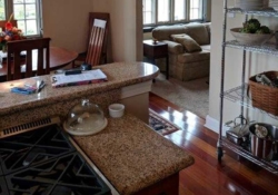
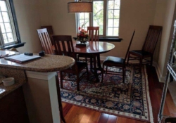
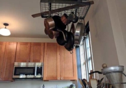
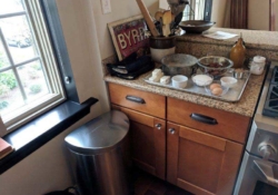
One of the primary objectives of the homeowners was to improve the workflow and to simultaneously increase the working and storage space of the kitchen. The couple shared a passion for cooking and baking and they wanted the new design to maximize the available counter space. As the before photos in the gallery below suggest, countertop space was indeed at a premium, especially when the mixer, food processor and flour storage were all out for a baking session!
In larger remodeling projects it’s not uncommon for us to bump out the kitchen, expanding the footprint into an adjoining space like a dining room or sunroom. Because this was a historic building with a concrete floor and restrictions on moving plumbing and electricals, expanding the footprint of the kitchen wasn’t an option.
So, when you can’t change the location of the plumbing, or expand the floorplan of a kitchen, how do you increase both storage and countertop space? It is times like these when the knowledge, experience and talent of an NKBA Certified Kitchen Designer can really make a difference!
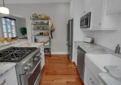
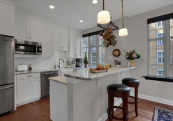
To solve this dilemma, Stacey began by extending the upper cabinetry to the ceiling. Not only did this add precious inches of storage in what was previously dead space above the old cabinetry, it also made the room look taller and the cabinetry more fully integrated into the space.
Second, to improve the utility of the cabinetry, pull-outs were added to the base cabinets and built-in organizers were added to the drawers. Often the very back of drawers and base cabinetry become a no-man’s land of hidden and forgotten items. Pull-outs and organizers solve the problem by making it convenient to see and reach everything that’s stored.
A Functional Space With Timeless Style
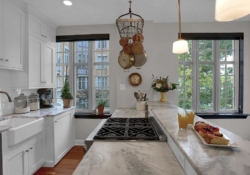
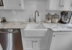
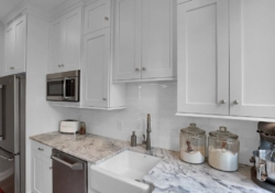
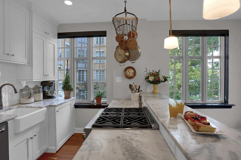
The stained oak cabinetry and brown granite countertops of the original kitchen made the space seem dark, even during the brightest daylight hours. The owners knew from the start that they wanted a classic white kitchen to brighten and visually enlarge the room. With the color palette already determined, the first design choice was probably the easiest as the clean, simple look of Shaker style cabinetry – in white, of course – was selected. In keeping with the white theme, the builder standard rimmed stainless steel sink was replaced by a much larger, visually striking white farm sink. Not only does the larger sink make it easier to clean pots, pans and cutting boards, it also adds a wow factor that makes this kitchen unique.
White subway tile chosen for the kitchen wall not only makes cleaning up after a cooking session easier, but also the ceramic tile’s reflective glaze brightens the counter space beneath the upper cabinetry, especially when the under-cabinet LED lighting is turned on.
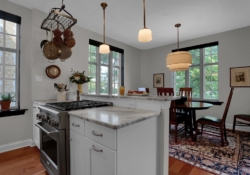
Topping all of the base cabinetry is a spectacular, white and gray veined marble in a leathered finish. The textured marble surface will not only help to hide the small nicks and scrapes that will come with use, it also adds visual interest in what might otherwise be a fairly monotonous sea of white.
Finishing Touches That Put This Kitchen All Together
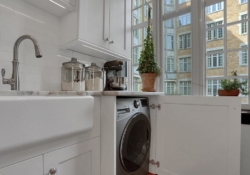
With all of the major requirements checked off, there were still some finishing flourishes that helped to make this small kitchen into a jewel box that won the owners’ hearts. First, as highlighted in the photo set below, Stacey was able to hide the single unit washer/dryer under just a few extra inches of countertop and base cabinetry. This seemingly small change to the original kitchen didn’t just win the approval the condo board, it transformed the room by concealing an appliance that was previously seen as an eyesore.
Another inspired touch was to custom-design an HVAC vent for the ceiling-height cabinetry above the refrigerator. As the photos highlight, the old cabinetry didn’t rise to the ceiling and a heating register, which could not be moved, was embedded in the wall above the refrigerator and cabinets. The elegant solution was an additional piece of ductwork and a custom register that is hidden in the trim above the cabinetry, making it almost invisible unless you’re looking for it.
In the end, we’re very pleased to report that the owners of this small unit in a historic Harrisburg apartment building are thrilled with their kitchen remodeling project. At Mother Hubbard’s we like to think that this 10 x 13 kitchen demonstrates that a clear vision and good design can make even the smallest space perform exceptionally while looking spectacular.
