Carlisle 1990's Construction Contemporary Renovation

BEFORE AND AFTER: What happens when you’re knee-deep in a kitchen renovation and a hidden problem behind the drywall is revealed? Read on to discover how we turned a “take-a-deep breath” situation into a beautiful kitchen and a safer, more structurally sound home for the happy client. Oh, and along the way we transformed an ’90’s walnut kitchen into a cool, contemporary oasis.

One of the great pleasures in calling the Harrisburg metropolitan area home is a wonderful mix of urban and rural minutes from one another. For example, within a twenty minute commute to the Capital or Naval Ship Yards, you can find yourself in the middle of some of the most lush farmland in the country. Dotting the miles of farmland are beautiful homes, many built in the 1990’s and early 2000’s, with lots of size, acreage and possibilities.

Recently, Mother Hubbard’s was invited to help a Carlisle family renovate the kitchen of their twenty five year old home. Our charge was first to make the kitchen and adjoining breakfast area more functional, and second to create a contemporary, unique space that would reflect the aesthetic of the clients.

A Builder-Standard Kitchen Whose Time Had Come and Gone

Our clients, two professionals with children ranging from elementary school to college aged, lived in the home for over a decade. They are a busy household with an active lifestyle that needed an open kitchen and breakfast space to better suit their needs.

Belying the two-story farm house exterior, our clients had a passion for the modern and contemporary. While much of the home reflects this aesthetic, the boxed-in kitchen and builder-standard, oak cabinetry did not.

BEFORE PHOTOS

As the “Before” photos suggest, for a 3,500 square foot home, the U-shaped kitchen was a fairly modest 14 by 12 feet. While the kitchen opened to a breakfast area of equal size, the spaces felt cramped because the bar leg of the “U” created a hard, visual break.

In addition to the aesthetic problems of the kitchen, the space suffered from a lack of functionality. Specifically, the work triangle extended across the largest expanse of the kitchen, requiring more than a few steps to move from cooktop to sink to refrigerator. Second, the empty space in the center of the kitchen created a dead zone that was too small for an island while being too large for an effective work triangle.

BEFORE FLOORPLAN

Creating An Open Concept Kitchen

AFTER FLOORPLAN

The first decision was the easiest as we all agreed that the breakfast counter leg of the “U” had to go. This not only opened the kitchen and breakfast areas to one another, it also permitted the inclusion of a large center island that dramatically increased the usable work space. By placing the island half way between the old kitchen and breakfast area, not only was the dead floor space eliminated in the kitchen, but the island also created a seamless visual bridge between what were two separate spaces.

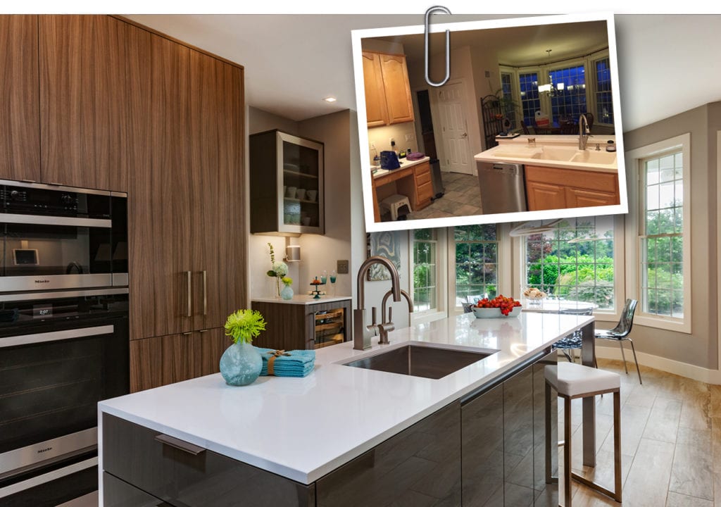
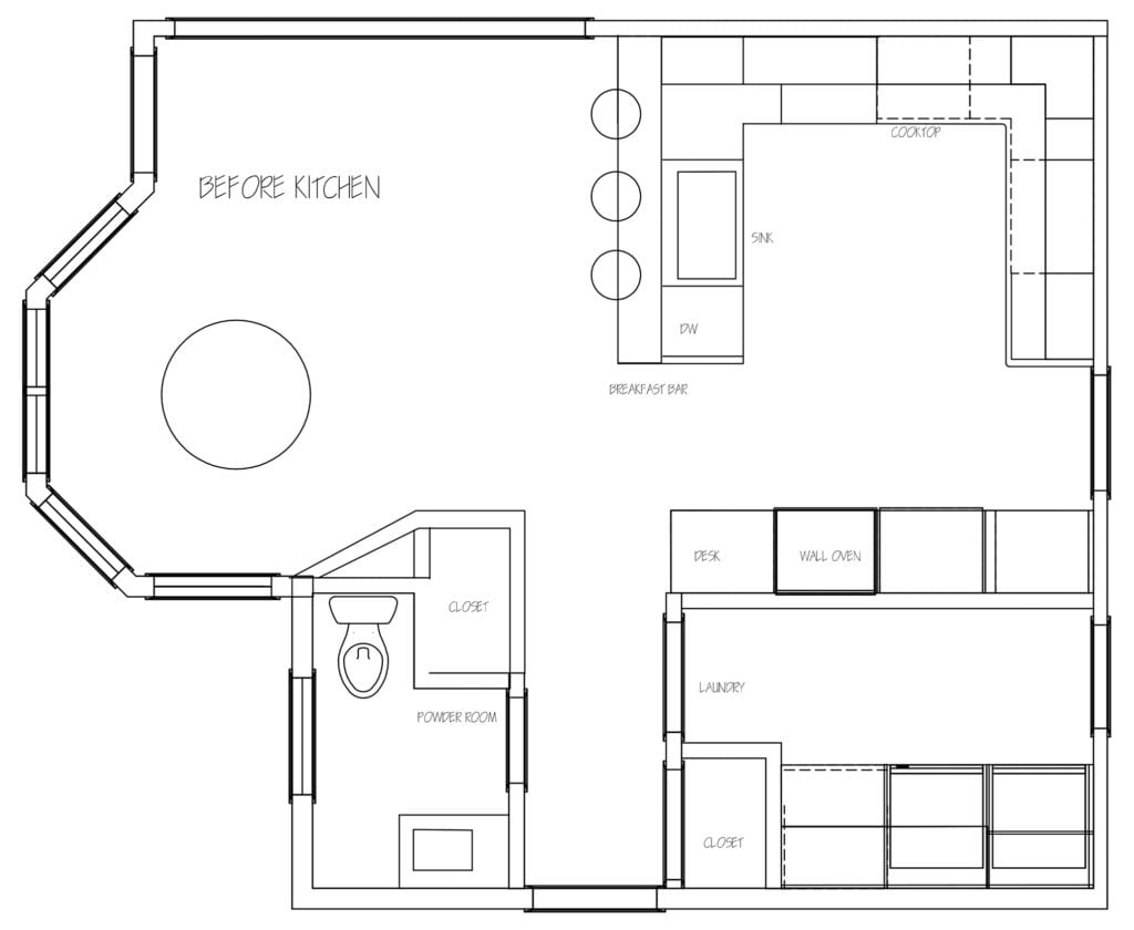
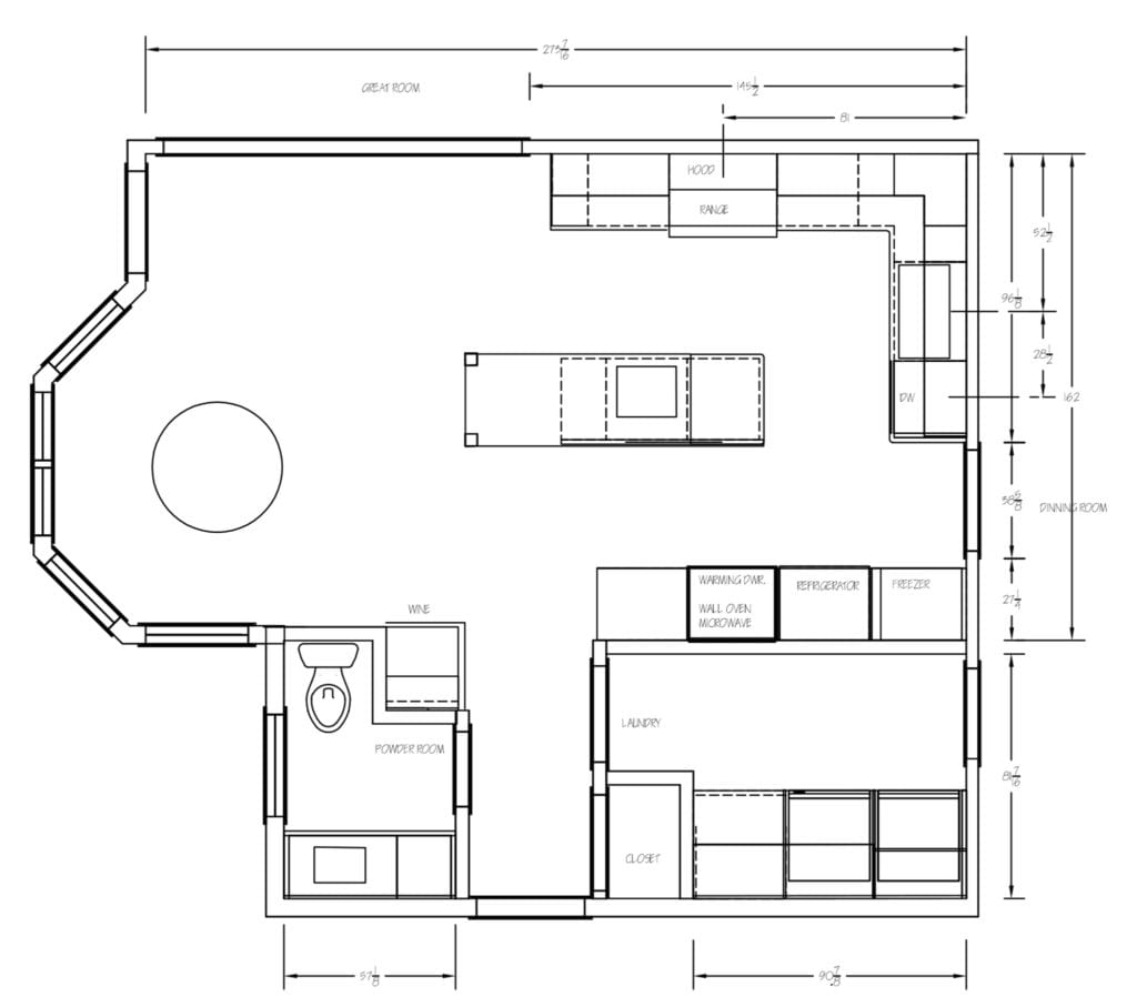
Referring once again to the “Before” floorplan you’ll note the small pantry closet located adjacent to the powder room in the breakfast area. The clients were never fans of the closet not only because the storage was too far from the kitchen, but also because the size of the pantry created an odd, angled wall that made seating around the circular breakfast table seem tight.

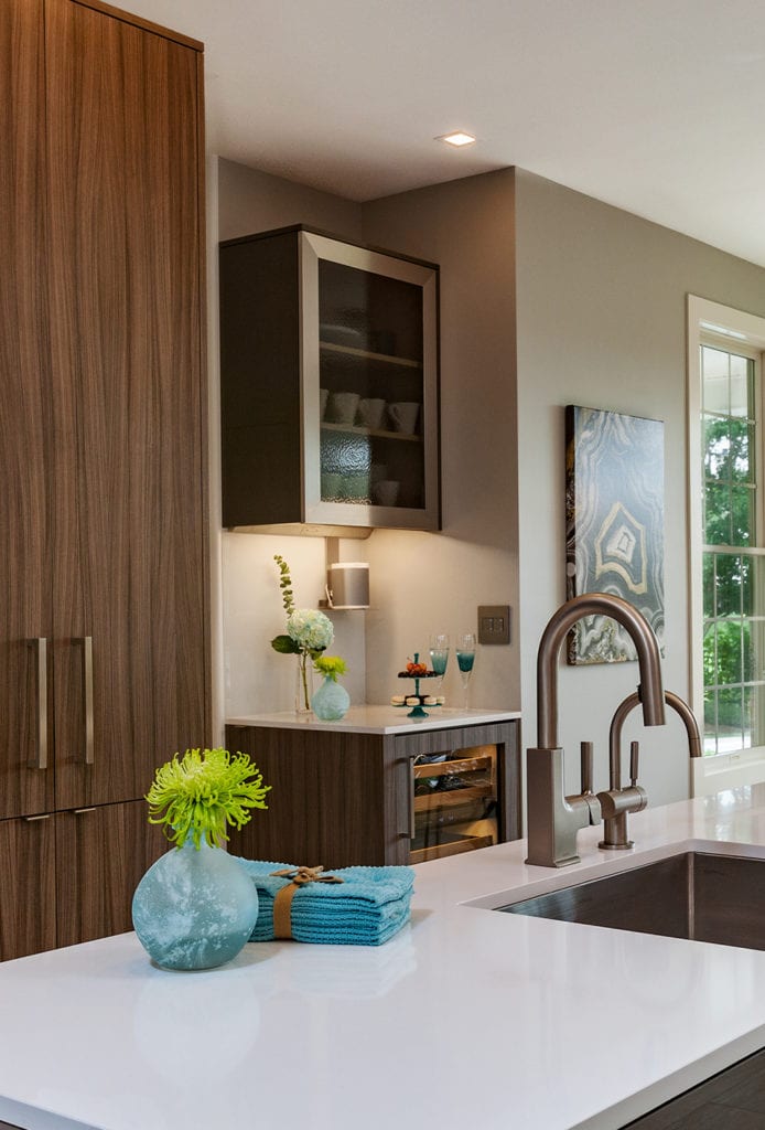
To remedy the situation, we decided to eliminate the pantry closet and replace it with a coffee and wine bar that would improve functionality and remove the oddly angled wall.

Discovering and Dealing with Hidden Challenges

Most kitchen projects run into a few challenges along the way, especially when demolition occurs. Once the drywall is removed, hidden construction flaws can be revealed. This is when having a skilled, experienced design team can be crucial to a project’s success.

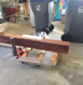
In the Carlisle home we found a not-so-pleasant surprise when we removed the pantry closet adjacent to the powder room. As you would expect in a large, open space, there was a 12” header that spanned the breakfast ceiling in order to support the weight of the second story of the home. When we peeled away the drywall we were shocked to find that the end of the header by the pantry closet was not held up by a load bearing wall, but rather was dangling in the air, supported only by the joists!

Our clients had an “aha!” moment when they realized that this construction flaw was likely the cause of their daughter’s second floor bedroom door never closing properly.

To remedy the situation we brought in an engineer who properly sized and supported a steel beam to carry the load of the second floor. We took advantage of the open ceiling to hide the steel beam, creating a seamless, horizontal plane from the kitchen into the breakfast space.

A Seamless Contemporary Aesthetic Meets Improved Functionality

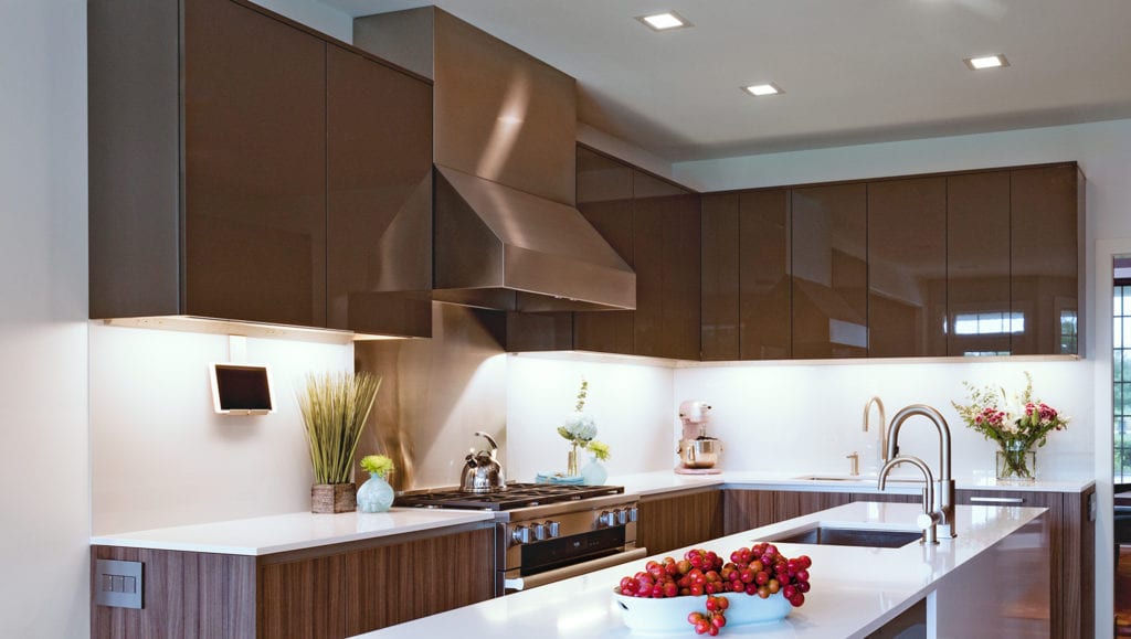
With the engineering challenges solved, the clients turned towards the design choices to be made in this contemporary kitchen. For the all-important cabinetry the homeowners chose Mother Hubbard’s Signature line with Full Access (frameless) cabinet doors. The Signature Line was the perfect choice not only because of its exceptional quality, but also because it can be customized to fit the owner’s unique needs. For example, the standard depth of most upper cabinetry is 12 ½”. While this standard depth will accommodate most plates, larger china can be a problem. Our Carlisle homeowners wanted and received upper cabinets with a 14” depth, allowing their special china and serving plates to be easily stored.

In keeping with the contemporary aesthetic, the upper cabinetry features a high gloss, brown lacquer finish. The “After” photos highlight that there is no hardware on the upper cabinets marring the flat look. Each door was extended down an 1 ½” below that bottom of the cabinet to allow for easy, no hardware look and access that creates a continuous, seamless appearance. You’ll note that the vent hood was also custom-sized to be sure that it too was flush with the upper cabinets’ 14” depth.

The base cabinetry is finished in an Italian textured, decorative laminate veneer (DLV) that not only has a beautiful wood-like appearance, but also is exceptionally durable and easy to maintain. While the pull-out drawers and pantries have rectangular stainless-steel pull handles, lower cabinetry doors feature nearly invisible finger pulls attached to the top of the doors.

Topping the base cabinets is Silestone manufactured quartz countertops using White Zeus Extreme. Consistent with the clean look of the kitchen, the counters are cut flush to the base cabinetry edge with no overhang. The kitchen island takes the contemporary look to its natural coda with the quartz counter wrapping around and down the back of the island.

AFTER PHOTOS

Painted Glass Backsplashes For a Clean, Contemporary Look

It won’t be surprising that the homeowners opted for a backsplash that maintains the uber-clean look of the kitchen. (No subway tile in this home!) The backsplashes underneath the top cabinetry and behind the cooktop are back-painted glass. Glass is both easy to maintain and very contemporary in look making it the perfect choice in this kitchen.

To keep from spoiling the pristine planes of glass, the power outlets and cabinet lighting are hidden underneath the cabinetry, eliminating the need for cuts into the backsplash and wall. Finally, the light switches are located on the end of the base cabinetry, rather than on the walls, removing yet another source of visual disharmony in the room.

Remodeling the Powder Room and Adding a Coffee/Wine Bar

The dramatic change from the builder-standard oak cabinetry to DLV in the kitchen required a similar transformation in the powder room. As the photos below suggest, the kitchen cabinetry, material and color was carried over into the half-bath off of the kitchen, creating a visual consistency that ties everything together.

In addition, the removal of the pantry closet provided space for a new wine refrigerator and wall space for upper cabinetry to hold wine and spirit glasses. The countertop created by the base cabinetry encasing the wine fridge is the perfect spot for a coffee maker or wine serving tools.

Practical Meets Perfect for an Exceptional Kitchen Remodel

In the end, our Carlisle clients were thrilled with their contemporary kitchen makeover. From the square recessed ceiling lights to the 8”x 48” custom ceramic tile floor, the project highlights a well-functioning kitchen design captured in unique and often unexpected material choices.

If you’re looking to create the kitchen of your dreams, no matter what aesthetic you favor, please give Mother Hubbard’s Custom Cabinetry a call. We’d be honored to help you transform your vision into the perfect reality.

Leave a Comments: