Camp Hill 1930’s Colonial Kitchen Remodel
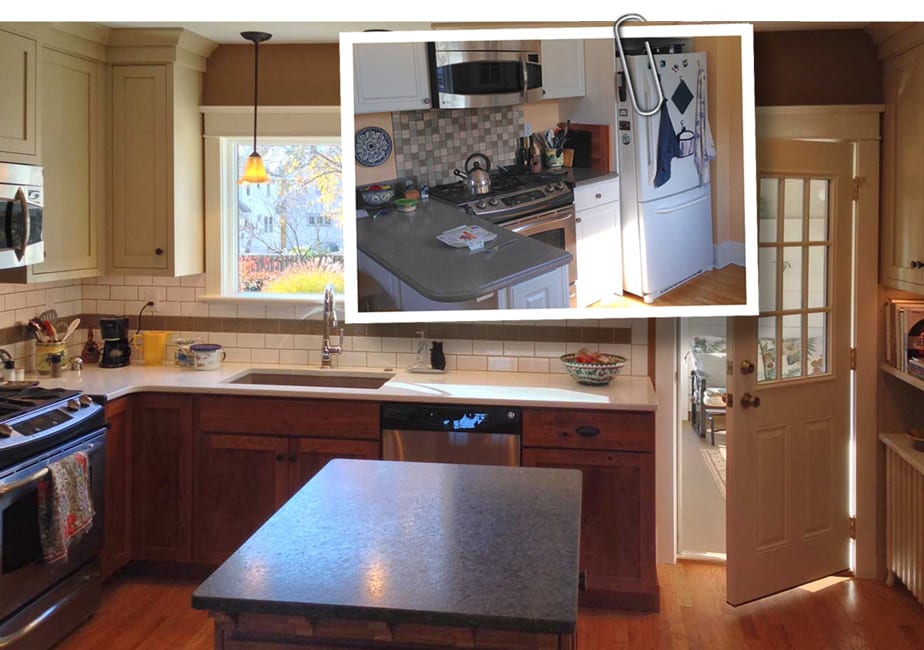
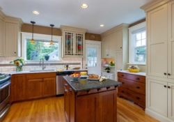
BEFORE AND AFTER: Some of our most beloved projects aren’t the largest or most lavish. As kitchen designers we take great pride in using our skill and experience to create an animated, inviting and soulful space. The owner of this small, 90 year-old kitchen wanted to open up the space by removing a wall that separated the kitchen from dining room. Where did all the storage space go when the wall was removed? Good question! Read on and leave a comment telling us how you think we did!
Peace Church, Camp Hill, PA
Camp Hill Pennsylvania, nestled on the west bank of the Susquehanna River, is a lovely community that makes the most of its proximity to the capital city, Harrisburg. With it roots in the early 19th century, it’s not uncommon to find three or four family generations still living in the area.

The fast-paced growth of Harrisburg in the early 20th century encouraged residential development in Camp Hill. In what is today affectionately considered the older part of town, dozens of homes were built on quarter and half-acre lots in the 1920’s and 1930’s. Owing to the German and Dutch influences, an eclectic mix of Colonial, Dutch Colonial, Shingle, Regency and even a few Tudor-style homes were built by local master craftsmen.
A typical street in an original neighborhood of Camp Hill
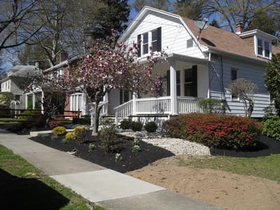
What makes this neighborhood wonderful is that many of the original homes – with various alterations – remain. An evening walk down any of the walnut-lined streets offers compelling testimony that older homes are not disposable and have much to offer 21st Century families.
One of the reasons we love the Cumberland Valley is that most respect the history of this area, and the families and homes that have come before them. Central Pennsylvanian’s generally believe that there is something inherently worthy about an 80 or 90-year old home that deserves respect.
In any suburb of Chicago, many of the modest, beautiful older homes of Camp Hill would have been torn down without a second thought. The quarter-acre lots would have been stripped clear and stuffed with 4,000 square foot structures screaming for attention, but lacking any real emotion or sense of place.
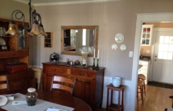
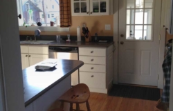
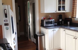
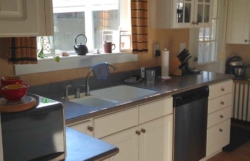
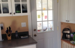
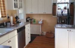
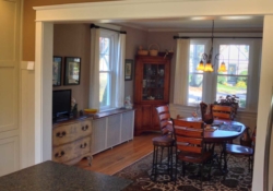
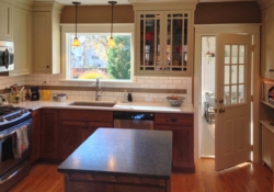
As we often are, we were blessed to be found by an owner who understood the value of her 80 year-old home and who wanted a new kitchen that was not only creative, but in tune with the history of the home. Take a look at the Before photos below.
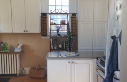
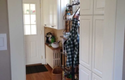
BEFORE PHOTOS
Done well, kitchen design embraces the soul of these older homes, protecting and cherishing what’s timeless while updating functionality and appearance in order to bring joy to their new owners. With designer Stacey Kocevar leading the effort, we eagerly set about the task.
For this 1930’s, two-story colonial the project goals included:
- Opening the kitchen to the dining room
- Improving usability of the counter space
- Increasing functional storage
- Complementing the historic details of the home
Opening the Kitchen to the Dining Room
Typical of most homes in the 1930’s, the small 14’ by 11’ kitchen was located in the back of the home and was separated from the rest of the house by long runs of wall space. As the Before floorplan suggests, this kitchen was largely closed-off to the other living spaces.
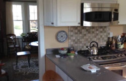
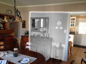
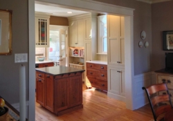
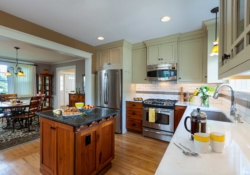
To open the kitchen to the dining room, the existing door was removed and the remaining opening enlarged to seven feet. This visual bridge has the added advantage of bringing lots of light into both spaces. Even with the wider opening, a seven foot wall still separates the kitchen and dining room. With the refrigerator and range hidden from the dining room view, there is still the sense of formality for guests dining in the home.
Improving the Usability of the Counter Space
If you were to consider only the square footage, you might think that there was ample counter space for this small kitchen; however, there is a significant difference between usable and available counter space. In the pre-remodeled configuration, the counter space along the walls was cut up into small chunks by the sink, range and hallway door.
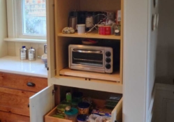
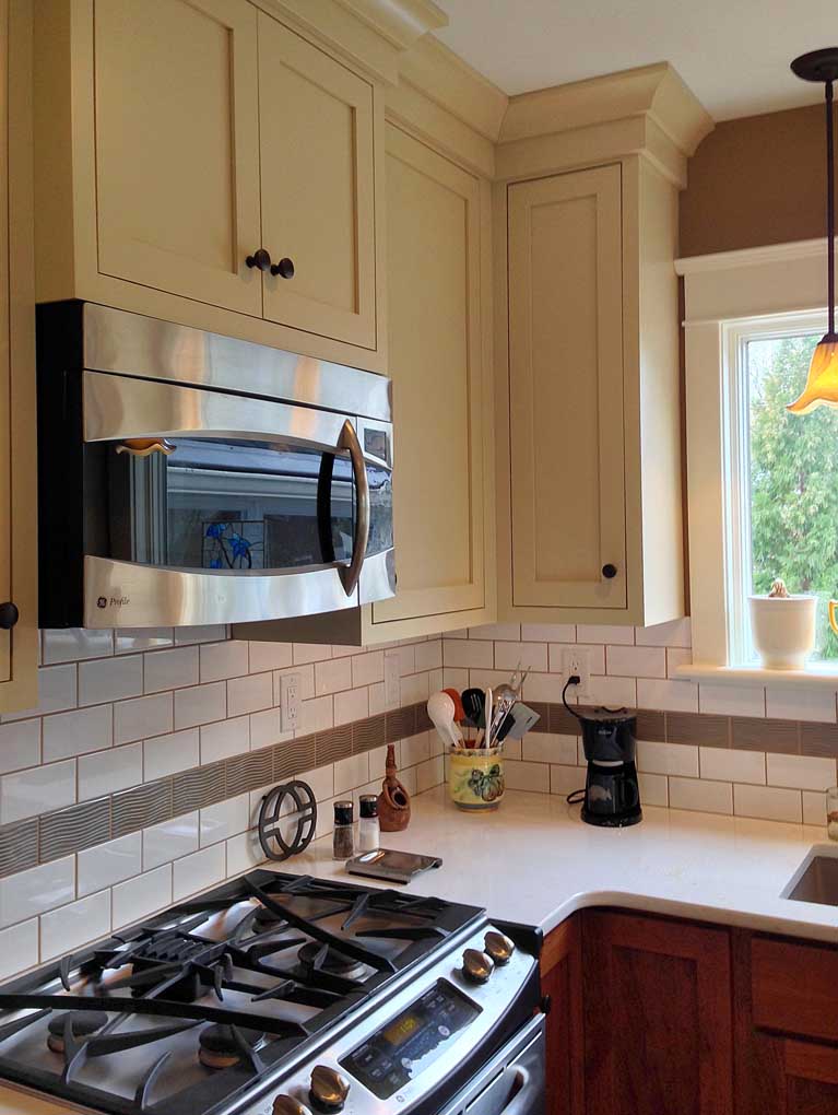
As in many kitchens, the countertop served as the storage spot for appliances such as the toaster oven, blender and coffee maker. To remove these space-robbing fixtures from the countertop, we designed built-in appliance storage, keeping the counters free and usable.
One of Stacey’s most creative appliance storage solutions was to take the oft-used toaster oven and to place it on a sliding drawer in a tall pantry cabinet. When not in use, the toaster is hidden neatly behind fold-away doors. When it’s time for toast, the owner simply folds the doors away, pulls out the toaster drawer and enjoys complete functionality in new-found space.
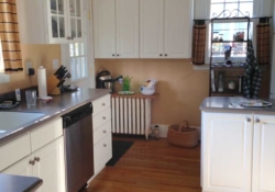
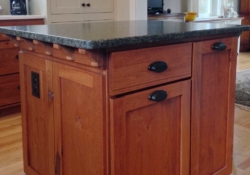
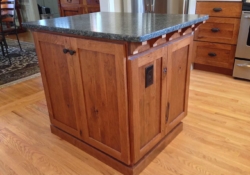
The most significant addition to usable counter space came with the creation of a small kitchen island. By enlarging the opening to the dining room we were able to add a proportionately-sized center island framed by the new opening, thereby adding nearly twelve square feet of counter space plus:
- Pull-out storage for larger spice containers, oils and other baking/cooking ingredients
- Double pull-out trash containers
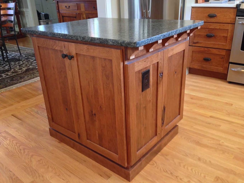
A small 3” overhang was added to the ends of the “Uba Tuba” Granite with a Leather finish to accommodate the small arts & crafts style corbels, as well as providing just enough room to allow people to comfortably sit at the island.
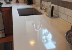
Another effective idea to increase usable space was to top the base cabinetry under the window of the west wall with the same white quartz counter top used around the perimeter of the room. Serving either as a secondary work area, or a place to hold the coffee maker, the extra counter space ensures that several people can work comfortably in the kitchen at the same time.
Increasing Functional Storage Space
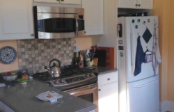
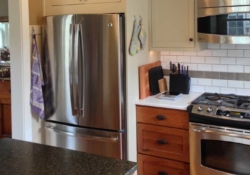
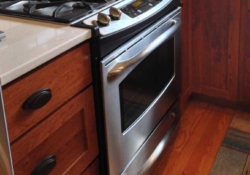
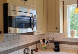
By widening the opening to the dining room by four feet, a large amount space for cabinets was eliminated. To compensate for the lost wall space, the rarely used doorway into the center hall was eliminated, as shown in the After floor plan. Not only did this recover wall space for cabinets, it also created a continuous run where the cabinet-depth refrigerator, range and microwave could be relocated. The result was an improved, tighter work triangle and a more open floor plan.
One of the hidden benefits to remodeling a kitchen is the opportunity to improve the efficiency and effectiveness of storage with custom cabinetry. By understanding how the space is currently used, the kitchen tools that are favored, and how the owners imagine themselves enjoying the space, a capable designer can utilize custom cabinetry and accessories to dramatically enhance both beauty and utility.
In our Camp Hill colonial, all of the cabinetry was custom-designed and made to order. Utilizing the Mother Hubbard’s branded line of cabinetry allowed us to extend the height of the upper cabinets flush to the ceiling. Not only did this add needed inches for storage, it also created a more fully-integrated look for the room.
PHOTOS OF STORAGE SOLUTIONS
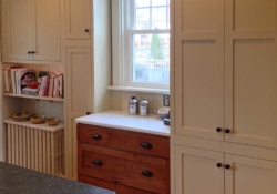
Another excellent example of the use of custom cabinetry is showcased on the West wall of the kitchen. Previously, wasted space under the window created an uncomfortable void that was poorly filled by a wrought-iron rack. This problem was solved with a beautiful, asymmetric wall of cabinetry that frames the window, and fills the void, all while enhancing the appearance of the radiator and increasing usable storage by nearly 50%!
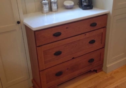
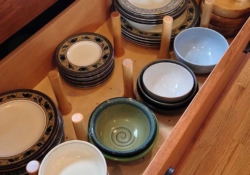
The highlight of this section of the kitchen is the visually free-standing piece of furniture under the window. The smart use of a furniture valence as the foundation for custom cabinetry lifts the piece elegantly towards the base of the window. The effect is a period-correct look, and an architectural piece that feels like a family heirloom but functions as efficient storage, that includes two drawer systems with adjustable vertical wood pegs to keep dishes secure and easy to reach.
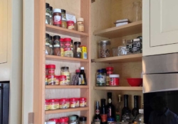
The cabinetry on the surrounding walls feature a number of unique accessories, including a super susan with large, independently rotating, trays which are mounted to the floor and middle shelf of the base cabinet, cutlery drawers with movable wood dividers, and the aforementioned pull-out shelves inside the tall pantry. Up above, a cabinet door next to the range fitted with an integrated spice racks solves one of the real challenges for those with culinary aspirations.
The finished canvas is an integrated suite of cabinetry that respects the 80 year-old bones of the home, while raising functionality and ingenuity to 21st Century standards.
Complementing the Historic Details of the Home
One of the reasons that Mother Hubbard’s was chosen for this remodeling project was the owner’s pleasure at bathroom renovation work that was completed two years earlier. As with this kitchen project, the owner wanted the remodeled bathroom to respect the original design and aesthetic of the home. Stacey accomplished this by updating the bathroom layout and fixtures while faithfully recreating the period trim and bead-board woodwork that had been lost to previous renovations.
When it came time to redo the kitchen, a simple yet elegant Shaker-style was chosen for the cabinetry. The understated, utilitarian look is timeless and a much more appropriate choice than the white, builder-standard cabinetry it replaced.
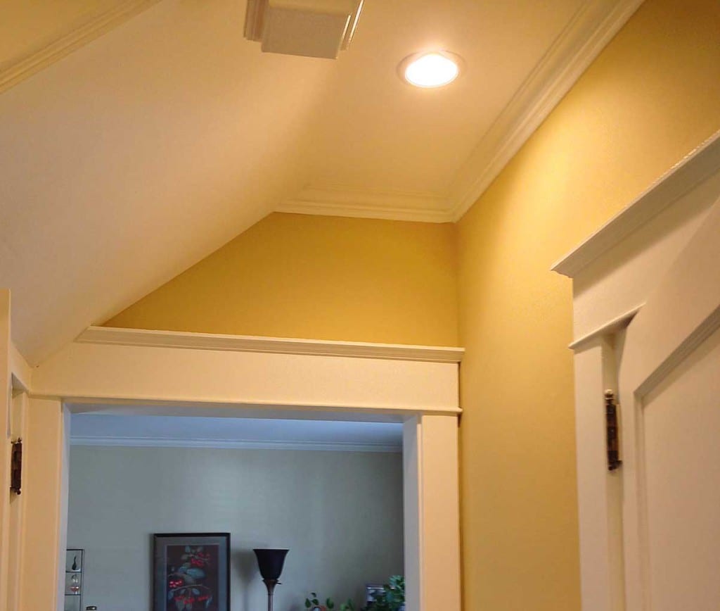
To reclaim the heritage of the kitchen, and echo the vintage details found elsewhere, we recreated the original trim and bead board that highlights untouched parts of the home. The original woodwork had long been removed from around the doors and windows of the kitchen and was replaced with off-the-shelf trim pieces. The new custom woodwork serves as a unifying element with other spaces and helps to restore a more original look to the home. And the restrained use of custom-made bead board in small sections of the west-facing wall add a richness and elegance to the flat vertical surfaces that paint on wallboard could never match.
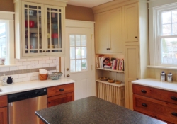
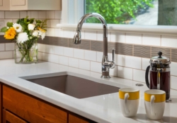
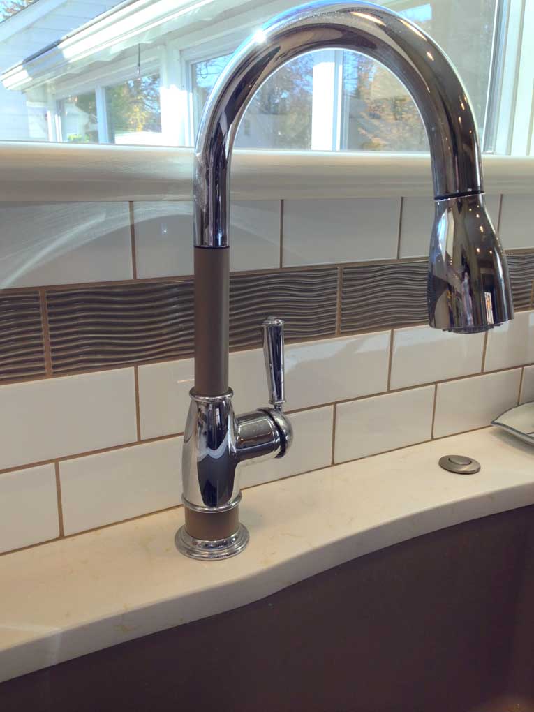
For the backsplash against the wet wall and above the range, white subway tile was chosen. The simplicity of the subway tile speaks to the Thirties and a row of earthen-green accent tiles, with their gentle, wave-like texture, add a bit of whimsy and interest to what would otherwise be a flat plane of white.
Finally, small touches that speak to the original home can be found everywhere. For example, the small arts & crafts style corbels that support and accent the 3” overhang of the center island are mirrored in a larger size as the supports for the bookshelf above the radiator. Indeed, the aging cast iron radiator itself was restored to its original 1930’s luster, using sand blasting and powder-coating in white to protect its shine for decades to come.
Designing a Space for Living
Intellectually, we know that homes are little more than wood, glass, plastic and steel. They are inanimate, lifeless, a place to eat, a place to sleep, an address on a street.
Yet we know it’s also true that homes can be so much more; they can reflect the lives and loves of those who inhabit them. They can speak with reverence to the past, and to previous owners who lived when life was simpler, distractions fewer, and moments with friends and family drew them just a bit closer.
At Mother Hubbard’s, we take great pride in our kitchen design and remodeling expertise. We excel at making great use of space by introducing new technology and solving problems.
However, our passion – the reason we are designers – is to create spaces for our clients that are animated, inviting and soulful. We think this 1930’s kitchen reborn is just such a place. More importantly, the homeowner does as well.

