"Big" Kitchen Remodel in a Small Hershey Home

"Big" Kitchen in a Small Hershey Home

BEFORE AND AFTER: The owners of a wonderful Hershey Craftsman-inspired home wanted to open up their small, four-walled kitchen into the dining room and beyond. But how do you remove a kitchen wall and all that cabinetry while insuring abundant pantry and storage space? Read on and you’ll find out how we worked around the challenges of a 90 year-old home to create an open-concept, modern kitchen that pays homage to the heritage of the home.

In the best sense of the phrase, Hershey, Pennsylvania was a company town. Founded in 1903, Hershey’s growth very much embodied the aspirations and inspiration of the man himself. While Hershey’s grand structures, like the Hershey Hotel, are what he’s best known for, his legacy includes dozens of modest, company-constructed homes that were originally owned and rented by Hershey workers.

Just this year, Mother Hubbard’s was asked to embark on a kitchen remodel in one of these lovely Hershey properties. Our client’s Craftsman-inspired home, built in the late 1920’s, had gone through a number of renovations over the years, but the small kitchen in the compact, 1,500 square foot home had remained largely unchanged.

Typical Craftsman Style Homes in Hershey, PA

Referred to designer elizaBeth Marcocci who had done work for a friend, our Hershey homeowner had several goals in mind for this kitchen remodel including:

  • A more open kitchen space integrated into the dining room
  • Additional counter top work area for food prep
  • Improved functionality for cooking and entertaining
  • A Transitional style that paid homage to the age of the home while having a modern feel

The Design Challenges Faced in This Small Home

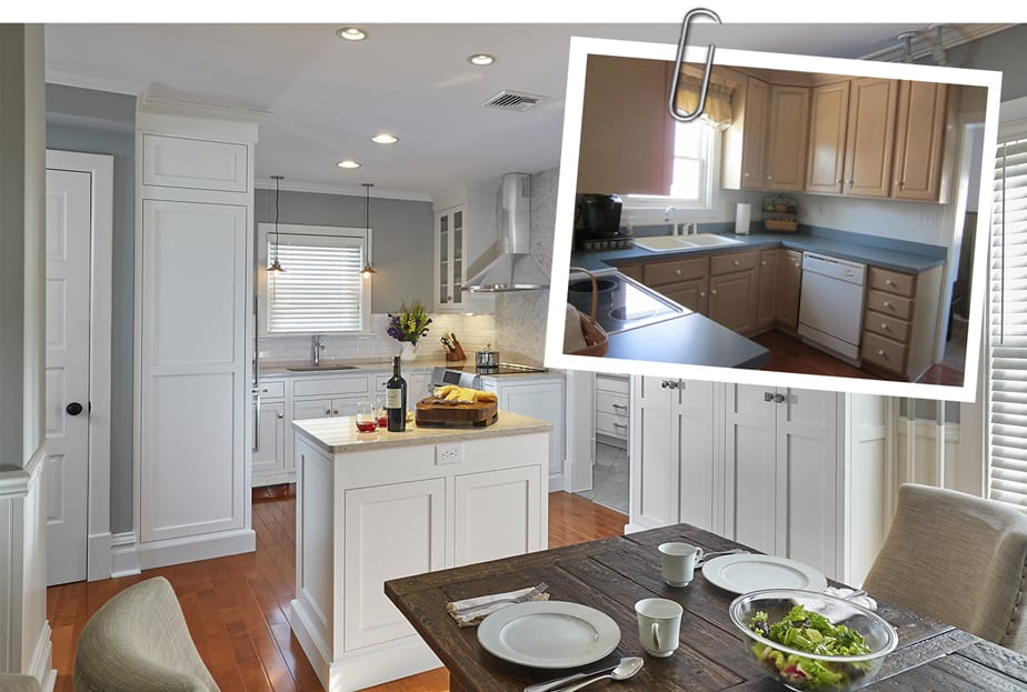
The original, “Before” floorplan and kitchen photos below show a tidy, but tight space that was largely isolated from the dining room and the rest of the home. Typical of a home built in the Twenties, the kitchen was minimized and considered largely as a utilitarian space meant to be “hidden” from the rest of the home. Over the years, and as appliances grew in size, the old configuration of the kitchen no longer worked. At some point the refrigerator moved across the room to a corner, making the all-Important work triangle between the range, sink and refrigerator both large and cumbersome.

BEFORE PHOTOS

A home that’s nearly 90 years old will also have some mechanical challenges that need to be addressed when remodeling occurs. Our home, featuring radiant heat, had both piping and radiators that could not be moved. In addition, the owner’s desire to remove the wall separating the kitchen and dining room meant that electrical needed to be relocated and the hardwood floor in the dining room had to continue seamlessly into the kitchen.

Designing a “Big” Kitchen in a Small Space

elizaBeth went into the project agreeing that the wall between the kitchen and dining room must be removed. The removal of the wall would dramatically open up the two spaces for entertaining and every-day enjoyment.

The challenge, of course, is that the elimination of the wall also meant the elimination of a nearly 5 feet of work surface, cabinetry and space for the fridge. To increase the countertop workspace, and to provide some highly functional storage, a free-standing island was designed and situated between the dining room and the kitchen.

The white, custom designed island features three sets of deep drawers flanked by wine cubbies on each side and a manufactured quartz slab serving as the countertop. The white marble quartz countertop and white cabinetry tie the island into the matching base cabinetry and work surface along the remaining walls. The island not only serves as a functional prep area when the owners are cooking, it also makes the perfect staging place for drinks and hors d’oeuvres when the owners entertain.

With the wall formerly anchoring the refrigerator now gone, a new home was needed for the biggest appliance in the kitchen. As the “After” floorplan and photos show, a sleek and slender 24” wide Bosch refrigerator-freezer combo was chosen for its size, function and form. This slim-fit fridge allowed both it and the dishwasher to nestle comfortably together along the same 82” wall. To provide a cleaner, built-in look for the Bosch, a floor-to-ceiling custom alcove was built. This cabinetry minimizes the physical and visual impact of appliance, integrating it more fully into the kitchen.

To increase the amount of usable storage space, Mother Hubbard’s designed a free-standing, pantry that looks like and is a beautiful piece of custom furniture. The pantry fits perfectly between the existing mudroom doorway and a large set of double-hung windows in the dining room. At over seven feet in height, yet only 15” in depth, the pantry offers plenty of storage without being intrusive in the combined kitchen/dining space. Once again, the white, flat-panel Mother Hubbard’s Signature Line cabinetry and crown molding match that used throughout the project, providing a seamless look to what might otherwise be a distraction.

AFTER PHOTOS

Improving the Usability of the Downstairs Mudroom and Powder Room

The original downstairs bathroom located off the mudroom and behind the kitchen was barely the width of the toilet and a pedestal sink. The mudroom itself was similarly uninspiring with a small window flanked by deep cabinetry that overwhelmed and darkened the space.

With an eye towards improving the usability and beauty of the powder room, Mother Hubbard’s moved the bathroom wall a bit less than 12” into the mudroom. This provided room for a custom-designed vanity topped with the same white quartz used throughout the kitchen. The bathroom sink chosen is a modern, white, rectangular floating bowl that is almost sculptural in its appearance. As the small vignette suggests, the extra space created in the bathroom transformed it from a cramped space into a show piece for the entire home.

The mudroom also received a makeover with a wider, brighter window and a properly sized built-in wall desk with just enough storage for phones, chargers, computers and a few file folders.

Design Choices That Make All the Difference

Kitchen designers add value in many ways, but what often separates great kitchen design from standard big box solutions are the unique design choices and innovative details. Here are some of our favorite design features, large and small, that make this Hershey kitchen so very special.

  • Simple flat panel cabinet design with inset doors to reflect the original wall panels in the house while providing needed clearances for appliances and special touches like pull-out trash bins
  • Seamless integration of a new wood floor from the kitchen into the dining room
  • Quartz countertops and a matching quartz backsplash wall behind the range hood to create a sleek transitional look that is also low maintenance
  • Beveled edge white subway tile underneath the cabinetry and behind the sink to create a clean look with visual interest in a white kitchen
  • Recessed ceiling lighting, under-cabinet lighting, and hidden power strips to clean up the appearance of the room and backsplash
  • Radiant heat pipes painted to match the wall and trim colors, minimizing their appearance
  • A 33” corner susan for easy-to-access pot & pan storage
  • A 9” cabinet height spice pullout that utilizes the space remaining between the 30” range and doorway
  • Vertical tray storage above the refrigerator
  • A space saver microwave hung under the white wall cabinets to camouflage the appliance while keeping it in a convenient place.

If you’ve been wondering how to transform your small kitchen into an expansive, functional space, please give Mother Hubbard’s a call. We look forward to offering our help.

Leave a Comments: