Opening Up Our 1950's Colonial Kitchen & Home
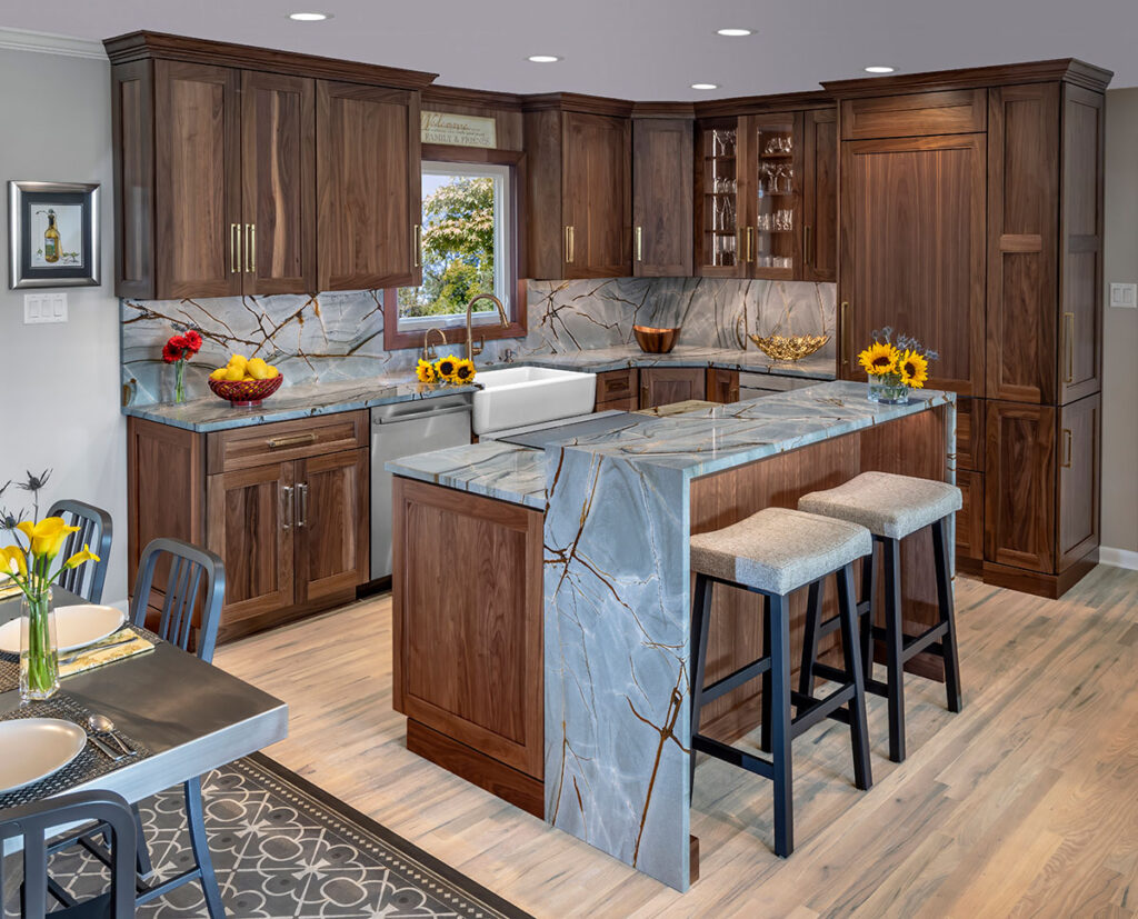
BEFORE AND AFTER: Carol and I love this home. We’ve been blessed to raise our two lovely daughters in this home, and to now be able to host their growing families in the space where they grew up. When we made the decision to make this our forever home, we knew we couldn’t wait any longer. It was time for the cobbler to make his family some new shoes!
There’s a humorous old saying that’s meant to poke fun at someone who works hard and is devoted to their craft almost to the exclusion of everything else. The proverb goes, “The cobbler’s children have no shoes”. The tongue-in-cheek comment is meant to highlight the irony that a cobbler, who spends all day making shoes for others, may not have the time or energy to make shoes for his own family.
While the analogy isn’t perfect, it still brings a smile to my face when I think back over the years as my wife Carol and I bumped into one another in our very nice but cramped 30-year old kitchen. Here’s a little background. Soon after Carol and I were married in 1988 and very early on in my career as a kitchen and bath designer, we went searching for a home where we could raise our family. We settled on a very nice traditional home in Mechanicsburg close to the elementary school that we hoped our girls would attend.
Not long after we moved into the new-to-us 1950’s home, we took the modest funds we’d accumulated at the time and upgraded the kitchen with some cherry cabinets, a Sub Zero fridge, and new countertops. Over the years we added new appliances and a peninsula island and upgraded to granite surfaces, but the kitchen floorplan itself didn’t change.
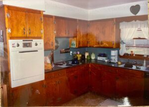
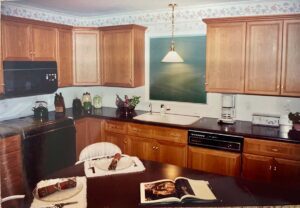
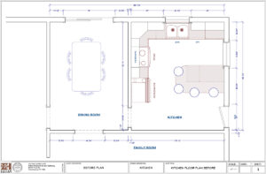
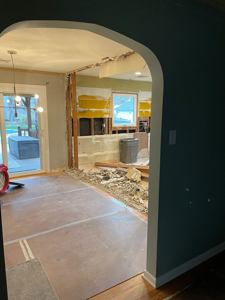
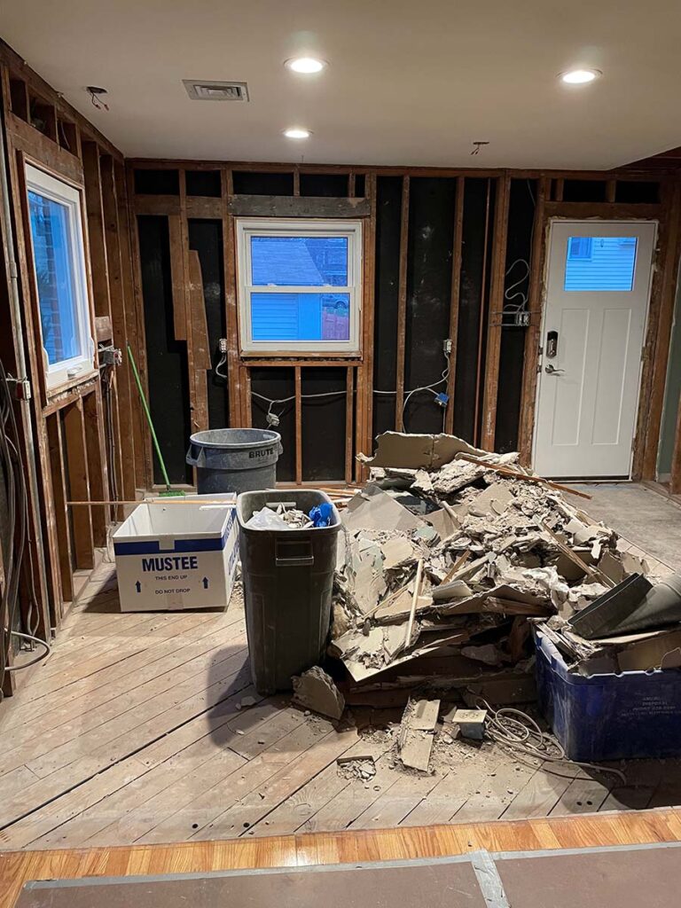
As you can see from the “Before” photos and floorplan below, ours is a fairly typical traditional home with the kitchen being separated from the dining room and living room. While the addition of the peninsula added much needed work surface and storage, it really made it a tight squeeze for more than one person to be working at any given time.
All that said, we have loved the home, the neighborhood, and the blessed times we’ve shared, often right in the kitchen! From being able to wave goodbye to the girls as they ran across the street to the elementary school, to seeing them walk through our door today with their children and husbands in tow, Carol and I love this home.
Because our family is the most important part of our lives, we were determined that this home would be our forever home. With that decision made we set off to make our now decades-old kitchen something special.
The cobbler was about to make his own family a pair of shoes!
AN OPEN SPACE KITCHEN FOR FAMILY GATHERING AND ENTERTAINING
Carol and I both agreed that with our expanding family of grandkids and sons-in-law, having an open kitchen design where gatherings could easily take place was a must. I also yearned for the day when Carol didn’t have to do kitchen duty by herself because of the lack of space for two people to comfortably work in the space at the same time. She loves to be the host and to entertain, but when she’s in the kitchen she can’t participate in the entertainment happening outside of the kitchen walls.
One thing Carol was adamant about was not losing storage space. In fact, the second bullet on her must-have list was to increase the pantry storage. You can imagine then that when I showed her my new, wide-open floorplan with the removal of eight feet of wall and the cabinetry that went with it, she was concerned.
She didn’t think there was any way I could summon up some kitchen design voodoo to remove two walls while increasing storage. I had to gently remind her that I do this all the time and that as the only client I can truly say I love, she should trust me and the process! While I didn’t have to pull out my CMKBD certificate to convince her, the look on her face signaled that I had best be on my A-game!
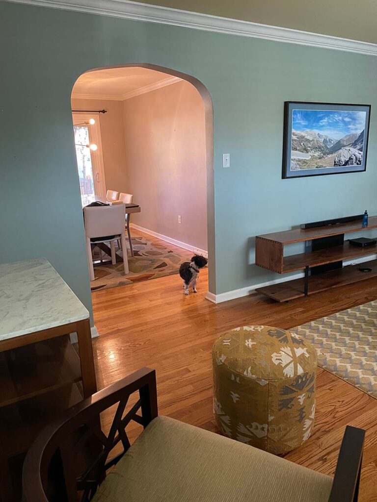
The set of photos below highlights how the original living room and dining room wall, with its small arched entry into the kitchen, was blown out and replaced by a structural steel header that now carries the load of the second floor. I’ve removed walls like this in dozens and dozens of homes and it never ceases to amaze me how transforming the removal of walls can be, especially in more traditional homes.
INCREASING AND ENHANCING STORAGE
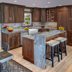
Once the space was opened up by the removal of two of the kitchen walls, it was time to put “Operation Increase Storage” into full effect. First, as you’ll note in the before images, our old kitchen had upper cabinetry that terminated below the ceiling. When you have a walled in kitchen like ours, you can make the space feel claustrophobic by extending the cabinetry to the ceiling. With our new, wide-open kitchen, that was no longer an issue as the floor to ceiling cabinetry can actually make the space look taller.
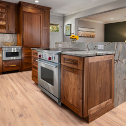
In the old kitchen we had two windows with one above the sink and the other as shown below on the perpendicular outside wall. Because the new kitchen was open to the light from sliding doors of the family room and the large picture window of the living room, we actually closed in the window on the side wall of the home, creating additional space for cabinetry, a microwave drawer (of course!), and an integrated refrigerator with matching wood door panel.
Looking just to the right of the refrigerator towards the side yard door you’ll see pantry storage with a twist. Rather than having a pull-out pantry, we opted to have the cabinet doors on the side. The reason for this was pretty simple. The space between the fridge and the outside door just didn’t provide sufficient space for a pull-out pantry and the side-opening cabinet door offers easier access.
QUARTZITE BLUE ROMA NATURAL STONE AS A VISUAL FOCAL POINT
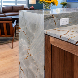
While you’re looking at the center island with its countertop seating you no doubt noticed the solid surface waterfall ends on both sides of the island. In fact, you likely saw the use of the same Quartzite Blue Roma stone as the backsplash along the walls.
Originally, we had considered what one might think of as the more traditional choice for a backsplash – tile. However, once we discovered the Blue Roma metamorphic stone, our imagination ran to using the material on both horizontal and vertical surfaces in the kitchen. Indeed, using Blue Roma as our backsplash seemed the natural choice that visually echoed the waterfall sides of the center island countertop.

As an aside, one of the services we’re most proud of at Mother Hubbard’s is that we don’t just send our clients off with a list of things they need to purchase like countertop material, backsplash tile and door handles. We always schedule these buying visits with our clients to serve as their guide, to be at the ready to answer any questions, or to use us as a sounding board for seemingly crazy ideas – like using a solid surface both as a countertop and backsplash!
The what-if questions that a client might have walking through rows and rows of granite and manufactured stone just might lead to a choice that transforms and ordinary kitchen into something truly extraordinary!
A PAIR OF SHOES WORTHY OF THE COBBLER
One of our favorite aphorisms at Mother Hubbard’s that we share with every client is, “we’ll never cook a meal in your kitchen, bathe in your bathroom or entertain in your family room. We fully appreciate that this is your space and it must reflect your desires, needs and personality.”
Welp, the exact opposite is true in this case and both Carol and I couldn’t be happier with the transformation of our kitchen and home from the renovation. While we’re nowhere close to retiring, we can absolutely see ourselves in this forever home for the next 30 years!

