A Carlisle PA Kitchen Reborn and Remodeled
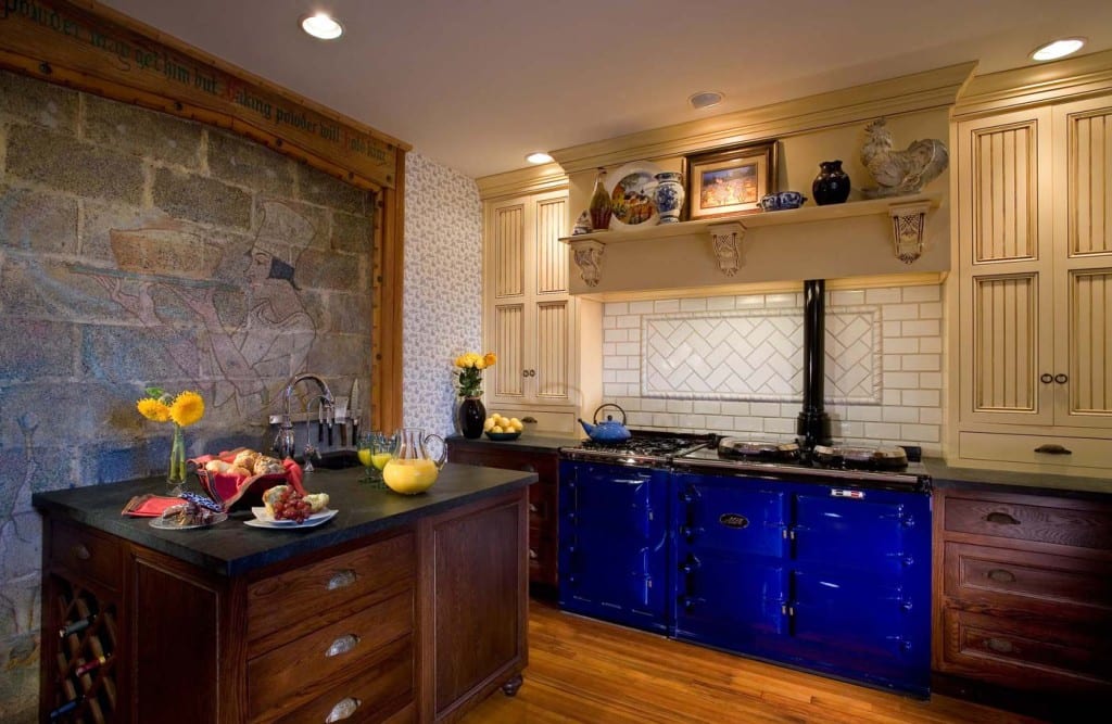
BEFORE AND AFTER: Most homeowners remodeling a kitchen are not attempting to preserve an historic home. As the sheetrock from the longest wall came down in the first phase of construction, a delightful mural of a baker, hand-painted by Williamson 80 years ago, was revealed. It was obvious to all what had to be done.
J. Maynard Williamson, Jr. was born in Pittsburgh, PA in 1892. His dream to become an artist led him to study at the Carnegie Institute in Pittsburgh and then on to the Art Student’s League in New York City. Talented enough to earn a steady income from commissions, Williamson returned to Pennsylvania, settling in the Harrisburg area with his wife Harriet. In 1927, Williamson designed and built a home in Carlisle, PA where he and his wife would spend the next two decades. Over the years the home had seen several renovations, some well done and others, not quite as much. A few years ago, Mother Hubbard’s was chosen to return this historic Carlisle home’s kitchen to its roots while upgrading its functionality and aesthetic appeal to a more current status.
Respecting the Heritage of the Home
Many times when a kitchen designer comes to a project, the homeowner is inclined to start from a blank canvas, leaving little to reflect the original architectural intent. However, the owners understood the history of the home and were determined that any changes would honor Williamson’s original design. Needless to say, homes were designed very differently in the 1920’s. Kitchens were a place to cook and were intentionally separated from the rest of the home. Appliances, such as they were, were small and the space itself was also made small to reflect the relative lack of importance of the kitchen – at least to the men designing the home. Working from a footprint of 10 by 14, Mother Hubbard’s was commissioned to turn the kitchen into a space that would accommodate the needs of a 21st Century family while paying homage to Williamson’s original vision.
Maximizing the Space in the Kitchen
Respecting the original design of the home meant that the footprint of the kitchen would not be expanded into other rooms. Every inch of space needed to be well-utilized to make the space function well for the family. An obvious first choice was to remove a powder room off the kitchen. A not-so-obvious second choice was to reconfigure a basement stairway and to annex a small closet that opened from another room. In all, these changes added 25 precious square feet to the kitchen.
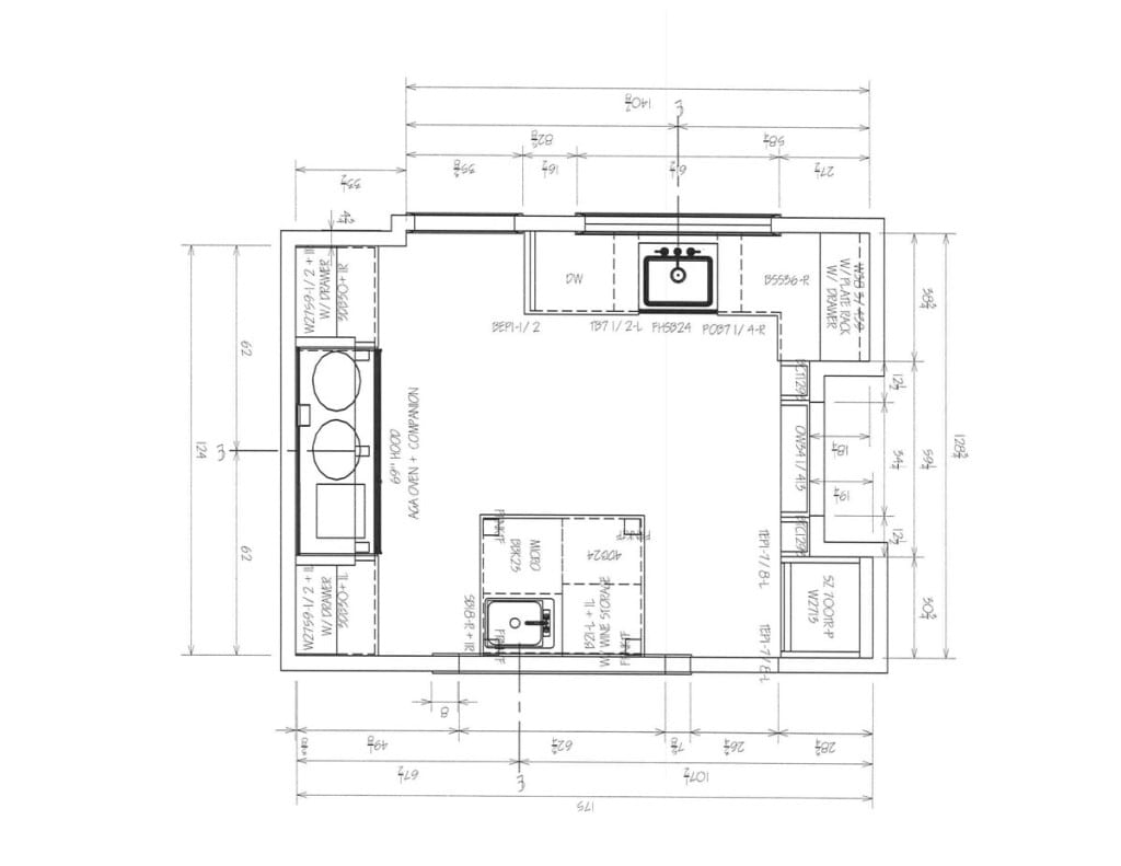
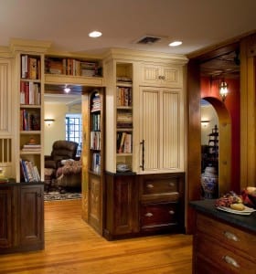
To make the most of the limited space cabinetry that would span the 8-foot vertical length of the rooms was designed. This created easily-accessible drawers and cabinets with pullout shelves for every day items in the base cabinets. Higher storage, accessed by a stepstool concealed under the toe-kick of the cabinetry, was perfect for less frequently used items and cookbooks in the built-in shelving. The base cabinets were Mother Hubbard’s Signature Line cabinetry constructed of oak with a dark stain and satin finish. The upper cabinets, spanning two-thirds of the 8-foot room height, were made of maple and were finished with a butter cream glaze. The doors of the upper cabinets feature a vertical beadboard insert that makes the room seem taller as the eye naturally rises towards the ceiling.
In one of the nicest touches of the room, the top and bottom refrigerator was hidden behind the same two-toned look – dark, espresso stained oak anchoring the bottom freezer drawer and butter-cream colored maple on top for the refrigerator section.
The Williamson Mural Hidden Behind a Wall
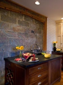
As is the Mother Hubbard’s process, comprehensive drawings were made before the first hammer was lifted. But sometimes, once you start peeling back the walls, you find surprises. Most of the surprises are unwanted, but in the Williamson home something magical happened. As the sheetrock from the longest wall came down, a delightful mural of a baker, hand-painted by Williamson 80 years ago, was revealed. It was obvious to all what had to be done. What was to be a wall of much-needed cabinets was deleted from the plan. The hidden mural punctuated by the aphorism, “Face powder may get him but baking powder will hold him.” carved into the wooden trim became a wall of art. To recover some of the lost storage space, a custom x by x peninsula with a prep sink was designed. The dark oak base cabinetry topped with a soapstone countertop mirrors cabinets and counters elsewhere in the kitchen. The peninsula is both beautiful and feature-rich with three deep drawers, a wine rack and a bit of under-sink storage.
Appliances, Finishes and Fixtures
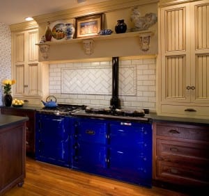
No one could miss the five-foot, deep blue AGA cooker upon entering this kitchen. Rather than folding silently into the wall, it stands out proudly and reflects the owner’s devotion to cooking. Invented in 1922, this cast-iron oven/stove combination, originally fueled by coal, was designed to always be on. Today, AGA’s are programmable and can be turned off, improving their efficiency without losing their prowess as a cast iron slow-cooking and baking wonder.
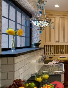
Soapstone is used for the countertops across the kitchen because of its organic, time-appropriate look and feel. To tie in the large, four-foot window looking out to the back yard, a wood windowsill was replaced with a 4” soapstone sill, creating the perfect sunning spot for herbs and flowers. Visually connecting the soapstone window sill and countertop is a backsplash of white subway tile, once again providing appropriate vintage appeal. And perhaps the cherry on this kitchen remodeling cake is a beautifully enameled Kohler farmhouse sink that features a whimsical stencil of fruits, vegetables and flowers. Where a white enameled sink might have evaporated into the subway tile, this sink holds its own and becomes another focal point in a room filled with detail and surprise.
Why Design Matters
Most homeowners remodeling a kitchen are not attempting to preserve the essence of a historic home. Yet, the same design skills that can bring beauty and function to a small 1920’s kitchen can transform an 80’s space into something memorable and unique. This Carlisle PA home was a once-in-a-lifetime project that allowed the Mother Hubbard’s team to demonstrate its passion for design and attention to detail. I like to think that we bring these same qualities into every project we do, no matter how large or small.

