Mechanicsburg Stone Farmhouse Kitchen Remodel
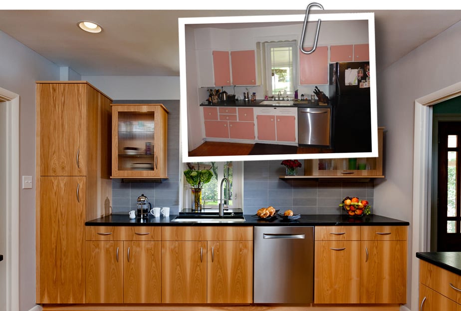
BEFORE AND AFTER: While an old stone farmhouse might not seem an obvious setting for a contemporary kitchen makeover, clean, straight lines were exactly what the active, adventurous homeowners wanted. So how do you integrate an eclectic contemporary kitchen in a stone farmhouse in Mechancisburg? Keep on reading to find out!
Our hometown of Mechanicsburg, Pennsylvania has more than its fair share of old, stone farm houses and Mother Hubbard’s Custom Cabinetry has been fortunate to be involved in several remodeling projects. One of our most recent kitchen renovations was executed in a two hundred year old farmhouse whose last kitchen renovation was probably thirty years ago.
The 2,300 square foot, two and a half story fieldstone home, located just south of the State Game Lands, is owned by a lovely, professional couple in their 50’s. They’re empty nesters who are very active, travel quite a bit, eat healthy and love to cook. Over the twenty-plus years that they’ve owned the home, they have renovated just about every room with the exception of the kitchen. We were fortunate that they came to Mother Hubbard’s in 2016 looking for a new kitchen with improved functionality, an updated look and some big surprises.
Pennsylvania Farmhouse Kitchen Meets a Modern Lifestyle
Normally when we approach a remodeling project in a home that’s a hundred or more years old we’re asked to preserve or even recover some of the original features or style. Our homeowners, much to our surprise and delight, wanted something very different. Being fans of modern and contemporary design, the couple asked us to use our imagination and to present some fresh ideas that while contemporary, would still live harmoniously with the farmhouse exterior of the home.
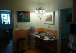
BEFORE PHOTOS
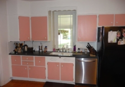
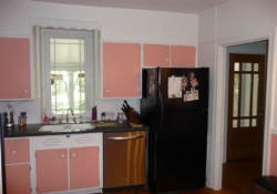
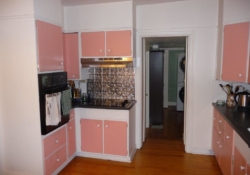
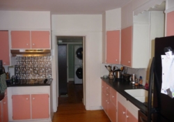
As the “Before” photos above suggest, the existing kitchen was in need of both an aesthetic and functional makeover. Remodeled back in the 1980’s, the white cabinets with pink door fronts didn’t just seem dated, they seemed out of place in a stone farm home that featured contemporary styling cues throughout much of its interior. When contrasted with the stainless steel dishwasher and the stark black countertop and refrigerator, the white and pink cabinetry created a visual tension between old and new that the hoped to resolve.
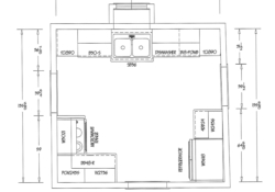
Before cosmetic changes could be addressed, there were several functional challenges to be overcome. First, as the floorplan shows, the location of the refrigerator along the primary, kitchen sink wall consumed much of the possible counter space. This forced a small freestanding table in one corner to be conscripted into service for food preparation. Second, the kitchen suffered from a lack of storage and while adding cabinetry was a solution, finding space without expanding the 13’ x 14’ footprint was going to be a challenge.
An Eclectic, Contemporary Kitchen Design
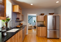
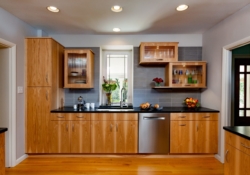
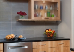
Our clients were adventurous souls both in their personal life and in their design choices. Rather than opting for a safe, traditional look, the couple selected Mother Hubbard’s Signature line of cabinetry with sleek, frameless doors. The photos of the cabinetry highlight the unique vertically matched grain of the wood from the bottom doors to the upper draws, creating an abundance of visual interest and energy in this small run of cabinetry.
To amp up the visual interest even more, we designed an asymmetric set of cabinets framing the kitchen window. On one side, next to a new, tall pantry, a vertical cabinet was centered on the wall. On the other side of the window, two cabinets of similar size were rotated to the horizontal and offset against one another with an open shelf providing balance to the unique design.
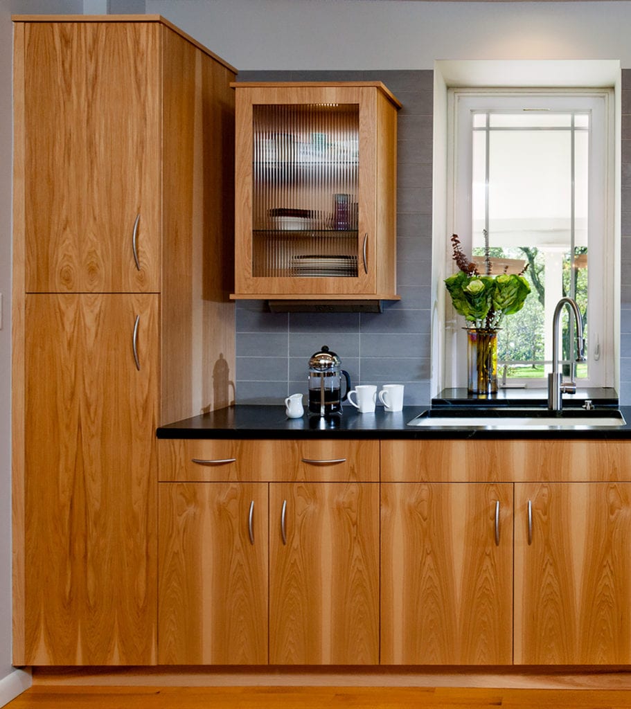
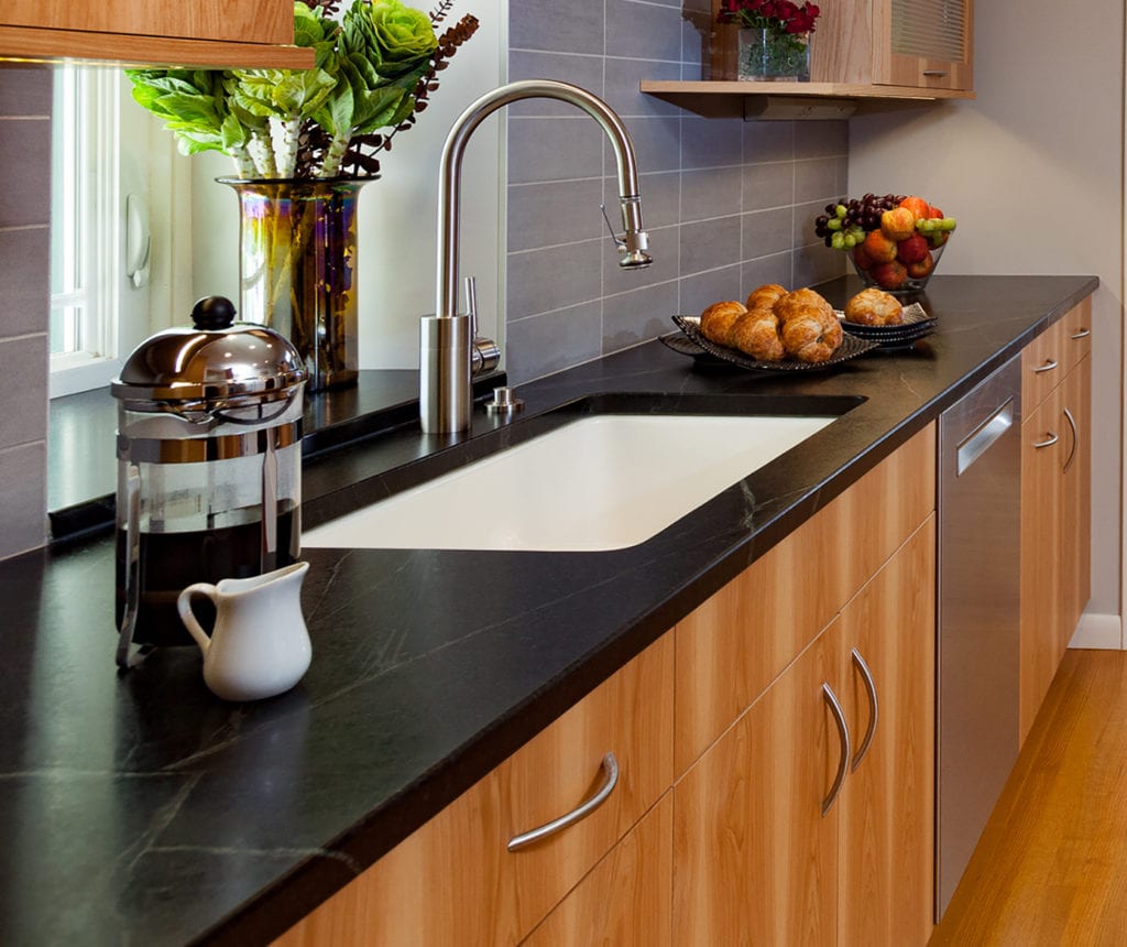
Complementing the unique cabinetry grouping was a backsplash comprised of oversized 4” x 12” grey porcelain tiles set in a stacked pattern. The tiles and installation lend a contemporary look and enhance the sense of openness in the small room. The countertop material chosen by the homeowners was a black soapstone whose flat finish and subtle texture nicely ties in the stone façade of the home with the new, modern kitchen.
The clean lines of the kitchen prompted us to eliminate a chandelier and to replace it with recessed can lights featuring variable output LED bulbs. Visible outlets were also removed from the kitchen sink wall and replaced by hidden outlet strips underneath the upper cabinets, keeping the walls pristine and clutter free.
Solving Construction and Mechanical Problems
As with any two hundred year old home, there wasn’t a level floor or flat wall in our client’s kitchen. In addition, because of the stone structure of the exterior wall, we had to cope with both a twenty two inch wall depth and a lot of imperfections. To resolve the challenges of an uneven stone wall, we furred out the kitchen window wall providing not only a flat, square vertical surface, but also providing space through which we could run electrical conduit.
Similarly, we had to solve the problem of an uneven, sagging kitchen floor. Originally the owners had wanted a tile floor, but we suggested wood as more forgiving to subfloor imperfections and for putting less strain than tile on the basement joists. The wood floor had the added advantage of allowing us to visually tie-in adjoining rooms by matching the species, color and width of the new wood planks.
As previously suggested, the owners allowed us to remove the small table in the corner of the kitchen, creating the opportunity to relocate the refrigerator to the other side of the room. After casing in the full-size refrigerator we added upper and lower cabinets in the remaining two feet, creating a bit of additional storage and counter space.
Great kitchen design brings together the vision of the client with the expertise of the (hopefully) NKBA certified designer. We’re simply thrilled with the finished kitchen in this old stone farmhouse and, more importantly, the clients are thrilled as well

