Linglestown Contemporary Condo

BEFORE AND AFTER: So, dear reader, what do you think of bold colors? Our Linglestown condo owner loved bold colors, especially purple. As designers, we love working with clients who have strong opinions. This condo project offered us an opportunity to stretch our design legs, cleanse our pallet of neutral colors, don a pair of sunglasses and to rock out a one-of-a-kind kitchen. Let us know what you think in the comment section below.
Founded in 1765 by Thomas Lingle to welcome settlers arriving from Europe, Linglestown sits at the foot of a mountain a few miles North East of Harrisburg. It’s one of several idyllic communities that while serving as a bedroom community for the Pennsylvania Capital, still maintains a unique identity and sense of pride. The town of just over 6,000 has many charms with the most notable being the flagpole standing tall in the round-a-bout that marks the center of the town.

While most homes in the area are detached, Linglestown has several developments of upscale duplex condos where owners can enjoy the space of a typical home with the convenience of a homeowner’s association and the services it provides.
As the “Before” photos suggest, the 20 year-old kitchen was very traditional with white painted cathedral doors and standard cabinetry. Typical of kitchens designed in the 1990’s, this home was U-shaped with one leg of the “U” serving as both an eat-at counter and divider to the family room.
BEFORE PHOTOS


Open Concept with a Contemporary Vibe
The homeowners had a vision of a contemporary, open space from the kitchen into the casual space at the back of the home. This meant transforming the U-shaped kitchen into an L-shape, losing both workspace and base cabinet storage.
To fulfill the homeowners wishes we needed to steal space from other parts of the home and to make design decisions that maximized both functionality and aesthetics. Sometimes the solutions are obvious. Other times, they are less so. Here’s where a designer’s experience and training can pay big dividends. As the photo of the old refrigerator highlights, the full-depth model extended almost a foot into the room and was an eyesore.
Our solution was to move the fridge to the other side of the hallway door, backing it against a coat closet where we could steal 12 inches of space. This not only increased usable floor space in the kitchen, but also created a cleaner, fully-integrated look.
Transforming a Dead Corner into a Focal Point
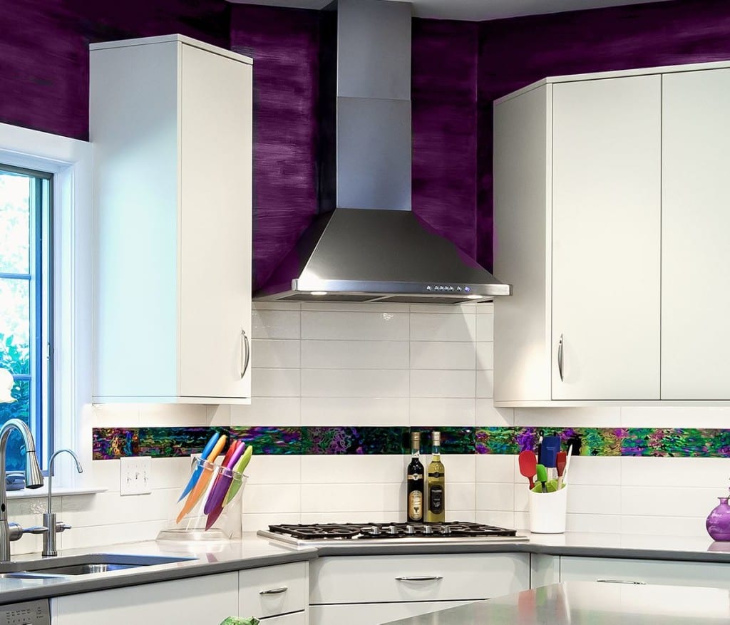
A corner in a kitchen is often synonymous with lost countertop and cabinetry space. Without the use of a step stool it’s almost impossible to reach the deepest recesses of an upper cabinet, and a countertop in a corner provides little utility. Our solution was to bump out the corner into a 36-inch rectangle nestled between two 45-degree bends in the cabinetry and countertop. Not only did this eliminate poorly used corner-space by allowing us to install a cooktop above the base cabinetry, it also created a focal point for the kitchen.
Increasing Storage and Workspace
As cooking enthusiasts, the homeowners wanted a kitchen with lots of storage and workspace. Our work began by doubling the size of the center island, recovering both base cabinetry and countertop area lost when the U-shaped kitchen was transformed into an “L”. At one end of the 8-foot Caesarstone-topped island we created an overhang that is perfect for two stools for guests or morning coffee for the couple. At the other end of the island we designed a small display cabinet facing the dining room, creating an unexpected bit of whimsy and interest.
The old kitchen featured a pantry closet that while spacious, was not user-friendly. Like most traditional pantries, it was difficult to find items hidden in the back, in the dark. To improve the utility of this storage space we designed a twin set of pull-out pantries that are an incredibly efficient, and fun way to store provisions for someone who loves to cook or bake.
Other unique storage solutions include:
- Pull-out trash drawers located in the island
- Upper cabinet vertical storage for cookie sheets and cutting boards
- Pull-out drawer under the cooktop for spoons, spatulas and other utensils
- A spring-assisted mixer lift that brings the twenty pound mixer to counter height
The Finish Choices That Make All the Difference
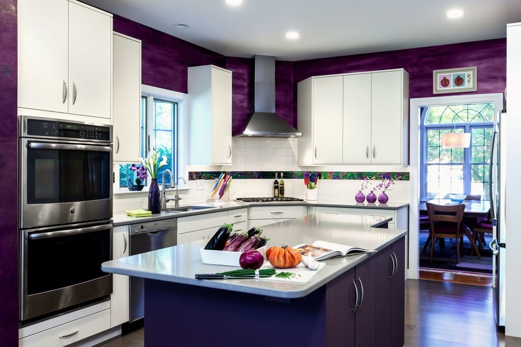
Our Linglestown homeowners wanted a kitchen with an unmistakable “Wow!” factor. Their inspiration was the deep plum paint on the walls of their dining room. We embraced their vision by suggesting a metallic plum painted finish for the wall space above the cabinetry. This bold color provides a wonderful contrast to the sleek, white cabinetry that forms the perimeter of the room. The base cabinetry of the massive center island picks up on the color theme with a custom plum finish. The light quartz countertops balance the eye-popping plum color, keeping the room fun, yet accessible.
Without question, what makes the kitchen sparkle is the one-of-a-kind white tile and iridescent accent glass tile that the homeowners sourced. The 4 inch by 16 inch glass tiles sparkle and hold your attention in a room with dozens of attractions.
A Home for Two That Entertains for Twenty
Viewed in its entirety, this Linglestown kitchen is certainly a one-of-a-kind that delights both the professional couple and the many guests whom they regularly entertain. Both functional and fancy-free, we’re proud that Mother Hubbard’s Custom Cabinetry had a role in this show-stopping space.
AFTER PHOTOS


