Lemoyne Open Concept Kitchen With a View
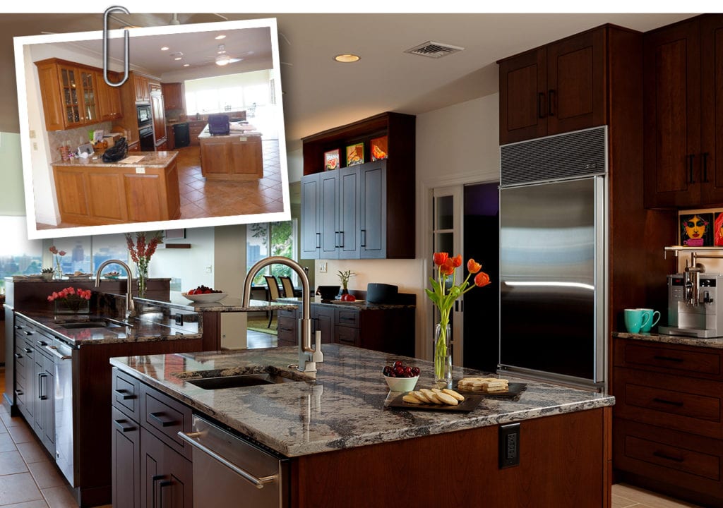
BEFORE AND AFTER: A successful couple with busy careers were determined to downsize their existing home while upsizing their ability to entertain family and friends. They found a property with spectacular views overlooking the Susquehanna River, and a home that needed a bit of help to make it the grand gathering space they imagined. The couple had three very specific goals in mind for their dream home. Read on to discover what these goals were and how we worked the owners to achieve them!
As a card-carrying member of the Baby Boom Generation – the end of the Boom – I sometimes ponder what Carol and I will be doing ten or twenty years from now. When the time came to pass the baton to me, my parents chose to migrate south, following the sun. I’m not so sure that’s what is in the cards for Carol and me, but I’m sure I’ll be told when the time comes!
Other than the cold weather, what’s not to love about living in the Susquehanna Valley as one nears the age when you can get 10% off at nearly any fast-food chain? As Americans we’re in better health, we’re living longer and we’re definitely working longer! Sixty is the new Fifty and at Mother Hubbard’s we’re seeing an increasing number of husbands and wives investing in the second or third kitchen of their dreams as they enter what used to be considered the golden years.
And why not? What better way to maintain positive energy and a forward-leaning attitude than to wake up in a home that you love?
Recently, Mother Hubbard’s was blessed with a new project from a successful professional couple in their sixties. Still professionally and personally active, the couple moved to Lemoyne from southern Pennsylvania. Their primary goals were to downsize their house while upsizing the enjoyment of every hour spent in a home closer to their work. The couple found exactly what they wanted in an extraordinary condo with a towering view of the Susquehanna River and the capitol in Harrisburg.
For those familiar with Negly Park on the west bank of the Susquehanna, you know that the views from high up on the bluff across City Island and towards the capital are among the most breathtaking in Pennsylvania. I don’t know of a more beautiful scene than the late afternoon sun shining off the Capitol dome from the park’s viewing area.
An Open Concept Kitchen to Emphasize the View
With their children grown and scattered across the US, our clients looked for a home that could be renovated to serve their active lifestyle. In addition to a passion for cooking, they wanted a home that could entertain up to 50 people in comfort and style.
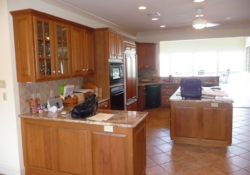
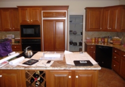
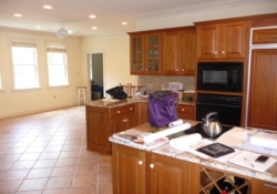
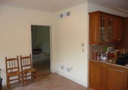
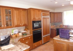
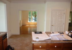
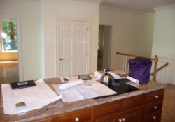
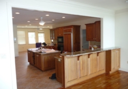
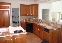
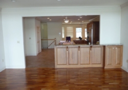
As the before photos below suggest, the existing traditional kitchen and adjoining living space were fairly separate from one another making each space seem smaller and all three a bit disconnected.
BEFORE PHOTOS
After listening carefully to the husband’s and wife’s needs and desires, we agreed upon three main objectives. First, the kitchen remodel had to provide a space that functioned well for the cook and for entertaining. Second, the renovated spaces had to take advantage of the wonderful city view for both the cook and the guests. Third, the husband had to be able to sit in his “comfy chair” in the great room and not have to look back at a messy kitchen.
One wanted a space for community and the other wanted peace and serenity.
Removing a Wall to Open Up the Possibilities
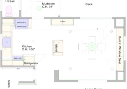
The original kitchen had a small door opening and pass thru window from the kitchen to the great room. The combined wall and peninsula island did not provide for an open plan that allowed for entertaining. Removing the wall between the kitchen and great room was the only way to open the space and take advantage of the city view. However this provided two additional design challenges. (photo)
First, as previously suggested, the husband was concerned about the view from the great room back into the kitchen. While they both wanted an open plan, he didn’t want the view back into the kitchen to look too . . . well . . .”kitcheney”.
Second, with the wall and peninsula island removed we also lost a great deal of countertop and cabinet storage that now needed to be redesigned elsewhere into the new kitchen.
A Long Kitchen With Countertops of Different Heights
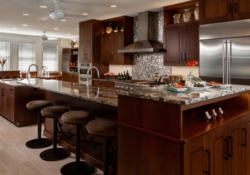
The new kitchen footprint, with the wall removed, was long and open-ended. The client didn’t want a peninsula with the sink designed in it facing the view because a) her back would be to her guests if they were sitting at an island behind her and b) she didn’t want seating designed in the peninsula because her guests’ backs would be against the city view.
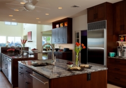
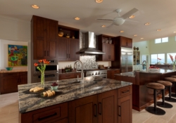
The solution was to create two islands with tiered countertops. The main island was designed with three different countertop heights. The main countertop with the sink and dishwasher was set at the industry standard 36” tall. The guest seating is at 42” height providing a nice backsplash for outlets and switches. The third countertop height is 45”. This cabinet is designed to face the great room and provide open space to display. The raised height provides for a nice counter to display a vase of flowers while also helping to hide kitchen countertop and bar stools. (The “kitchen” items they didn’t want visible while looking back from the great room.)
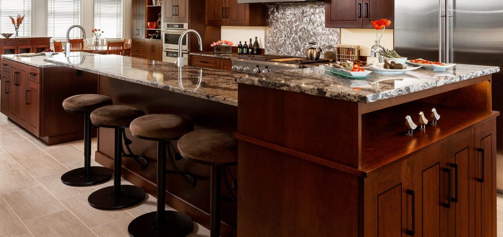
The second, smaller island was designed with a prep sink for cooking and a second dishwasher for easier clean-up after large parties.
Details of the Kitchen Make It Both Functional And Beautiful
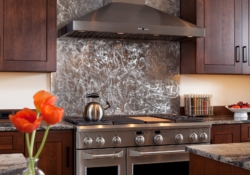
Every kitchen needs a visual focal point and in my client’s kitchen this was the 48” wide stainless steel range, hood and backsplash. Centered on the wall between the tall refrigerator and wall oven/microwave cabinet, generous countertop space is provided on each side. The stainless steel backsplash was designed to be full height and custom “carved” to draw ones’ eye.
Of course the foundation of any kitchen is the cabinetry, and the Mother Hubbard’s Signature Line of custom cabinetry was designed to the 9’ ceiling height. The floor to ceiling cabinets offered a unified look while also providing additional storage and a unique open shelf at the top to display the client’s collection of pottery.
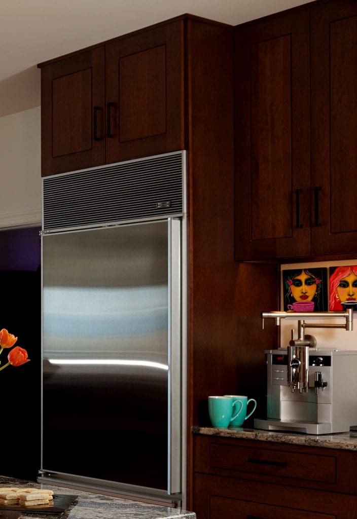
Every homeowner has something from their old kitchen that they want included in the new one, and in this instance it was a Sub-Zero refrigerator that the owner felt was too small for her entertaining needs, but still of value. To utilize the refrigerator we designed it into the kitchen on the guest side of the room, allowing for additional cold storage without the owner’s having to go to the garage or basement. That Sub Zero refrigerator also became the anchor for the clients love of coffee and her coffee bar. A pot filler, generally used at the range, was designed into the coffee bar space in order to fill the automatic coffee maker.
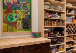
Finally, to increase storage we designed a large walk-in pantry, behind the main kitchen wall. Realizing that the pantry would be visited often during meal prep, and that the door would most likely remain open more than closed, a base cabinet matching the kitchen with a butcher block top was designed with no wall cabinet on top. This arrangement served as a focal point to enjoy while the door was open. The remaining walls were designed with a light maple, adjustable shelving to help maintain a more open feel.
Aesthetic Choices That Bring It All Together in This Lemoyne Kitchen
The new cabinetry was designed and specified to be cherry wood, stained with a full overlay door and drawer style. Transitional in its appeal, with cherry wood to provide warmth, the full overlay door style with a thin panel raise provides a more modern contemporary look.
The countertops were specified as quartz to provide a non-porous, easy-to-maintain counter surface for a very active cook. The countertop pattern was chosen to show “flow” to mimic the river in the view below.
Lastly the floor was designed with large porcelain tile, rectangular in its shape and transitional in its style. This is very durable flooring that is both beautiful and easy to maintain.
While we’re proud of every kitchen we’re fortunate enough to be a part of, this Lemoyne kitchen is very special, even by our standards! Like all good kitchen design it not only maximizes what’s unique about a particular house, such as the view, but also pays close attention to how the client lives and entertains in the home.

