Mechanicsburg 70’s Split-Level Renovation
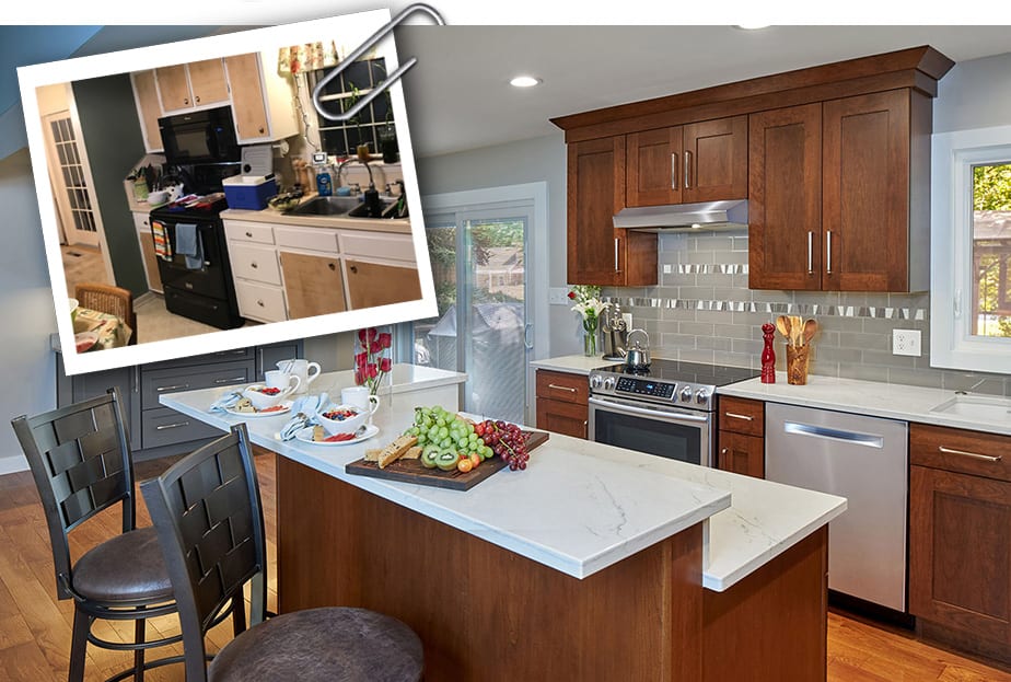
BEFORE AND AFTER: This project includes a kitchen/dining/family room renovation in a 50 year-old split-entry home in a great Mechanicsburg neighborhood. We reimagined the space and selected materials and colors that visually unified the three rooms and added continuity. The husband, a skilled woodworker, fashioned the beautiful cherry wood banisters and metal railings that add a unique appeal.
Mechanicsburg Split Level Renovation
Split-level homes, also known as split-entry homes, or raised ranches, typically feature a garage and stacked second floor bedrooms at one end of the structure and the living room, kitchen and dining room on other side. In some split-level homes there are also a bedroom, office, or family room on the partially below ground first floor, sharing a floor and ceiling height equal to that of the garage.
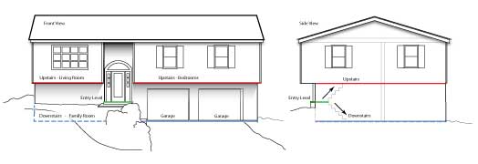
If you live in Mechanicsburg you know that many of our neighborhoods feature gently sloping properties. It’s no wonder then that builders, looking to build affordable homes, favored the split-level style in the 60’s and 70’s.
Untouched Split-Entry Homes Aren’t in Much Demand
With open floor plans being a pre-requisite for most home buyers today, untouched split-entry homes almost always seem dated. The floor plan’s small footprint, and the half flight of stairs leading to each level from the front door can create a closed and sometimes cramped feeling. While raised ranches might have been an economical way to offer more home on a small piece of land fifty years ago, home buyers are demanding more opens space today.
This summer Mother Hubbard’s had the pleasure of working on a major kitchen/dining/family room renovation in just such a split-level home. A young, professional couple had purchased a 50 year-old split-entry home in a great Mechanicsburg neighborhood. Surrounded by more recently updated and expensive homes, the home our client purchased came at a smart price because of the split-level’s waning appeal.
As you can see from the “Before” floor plan, the kitchen, dining room and family room are relatively small spaces that are isolated from one another due to the load-bearing wall running the length of the home. The question posed by our clients was, “How can we open these rooms up to one another?”
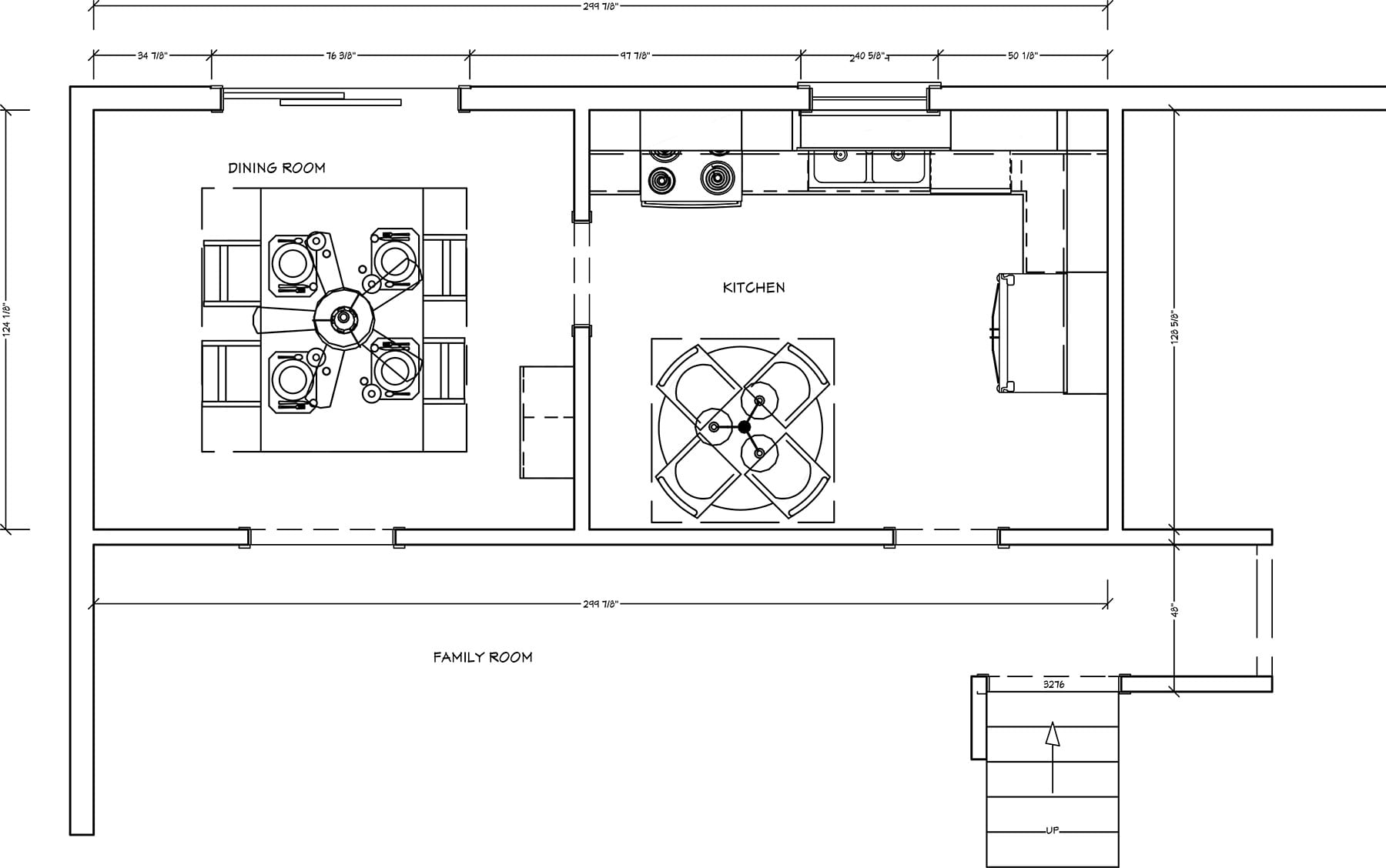
Creating an Open Concept Floorplan for a Split-level Home
To achieve our client’s desire of opening up the kitchen, dining room and family rooms, we knew that we needed to eliminate the load-bearing wall dividing the spaces.
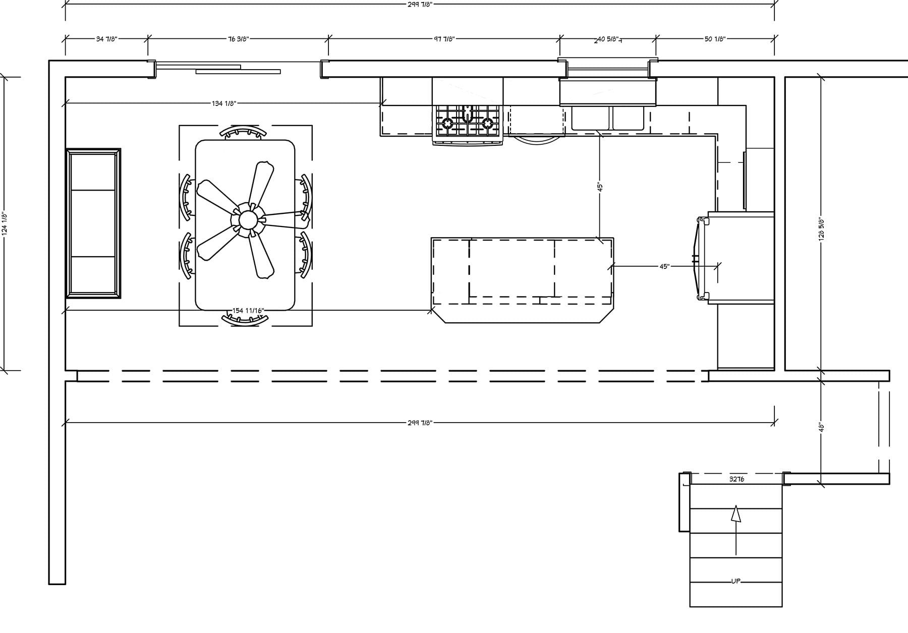
Step one was to bring in a structural engineer to review the integrity of the home and to suggest how best to go about removing the wall. A steel beam spanning the length of the removed wall would be a given, but whether to hide the beam in the ceiling or to position it under the existing ceiling joists was a decision to consider. On the one hand, embedding the steel beam above the ceiling would make for a cleaner, continuous look from kitchen and dining room into the family room. On the other hand it would be less expensive to position the beam below the existing joists, covering the descended beam with drywall.
In the end the homeowners chose to install the 23’ steel beam below the ceiling line, saving a couple of thousand dollars in drywall and paint labor that could be used elsewhere in the home.
The original builder of the home utilized a “swirl ceiling” decorative design throughout the home. Fashionable in this part of Pennsylvania during the 1970’s, drywall mud was applied with a brush to the ceiling in a swirl pattern, giving the ceiling an “interesting” texture. Had the beam been hidden in the ceiling, the owners would likely have had to strip away this textured ceiling from the hall and family room, replacing it with a typical, flat ceiling as was planned in the renovated kitchen and dining room. By selecting an exposed beam, the beam acts as a visual break between spaces, allowing the family room to retain the swirl ceiling look until the owners are ready to update it.
A Custom Kitchen With Standard Sized Cabinetry
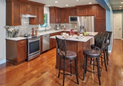
As the “After” gallery below highlights, one of the ways that Mother Hubbard’s can create a custom kitchen without the custom price is by leveraging our design skill and experience. For example, we can often use standard-sized, less expensive cabinetry to create a truly a custom appearance in a remodeled home.
AFTER PHOTOS
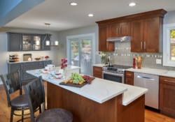
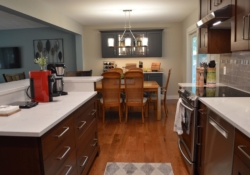
Our newlywed clients wanted to replace their builder-standard floating cabinetry with custom cabinets. Using standard sized cabinetry in combination with affordable custom trim pieces, we were able to insure that the upper cabinetry rose seamlessly to the ceiling. In addition, removing the wall between the dining room and kitchen meant that the arbitrary stopping point for the kitchen cabinetry was eliminated. With the kitchen flowing seamlessly into the dining area, where the kitchen cabinetry ends and the dining room begins becomes a non-issue.
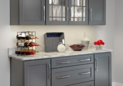
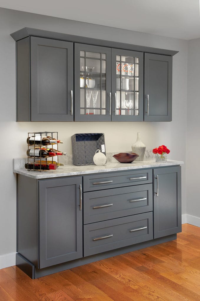
Another way we brought affordable custom design to the remodeled space was by imagining a grey, painted sideboard and hutch for the dining room that echoed the stained cherry cabinetry in the kitchen. Because the dining room cabinetry is painted, a less-expensive cabinet line from a different manufacturer could be used. No sense paying for expensive cherry wood that’s simply going to be painted over! Notice how by using the same upper cabinetry trim as employed in the kitchen the dining room hutch looks like a perfect match to the more expensive kitchen cabinetry.
Choosing a Transitional Style With Broad Appeal
Thinking both about current pleasure and future value, our clients chose a transitional style for their kitchen remodel. The framed upper and lower cabinet doors have a Shaker style sensibility, while the stained cherry provides a very rich, luxurious feel.
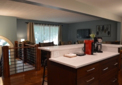
With the new open floor plan, the kitchen becomes the focal point as you walk from the front door, up the half flight of stairs and into the main level of the home. No longer hidden by a wall, your eye is drawn first to the new kitchen island with its seating space and white Corian quartz countertop. Then you naturally turn towards the dining room and family room, enjoying the wide-open floor plan that still retains a hint of visual separation between the rooms because of the cased-in steel beam. Perfect for every-day family living or weekend entertaining, the remodeled split entrance home seems totally appropriate for 2019 and beyond.
When Removing Walls Can Add Storage
Storage is at a premium in most homes and this is especially true with bi-level homes that have no basement. It might seem counterintuitive then to remove a kitchen wall because lost wall space often translates into lost cabinet space. However, in an older home with a small, boxed-in kitchen the removal of a wall can actually open up the possibilities for storage.
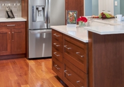
In our client’s split-entry home, the removal of the wall between the kitchen and family room created room for a tiered center island that includes two deep pull-out drawers for pots and pans, four drawers for silverware and cooking utensils, and enough countertop space for both food prep and casual eating.
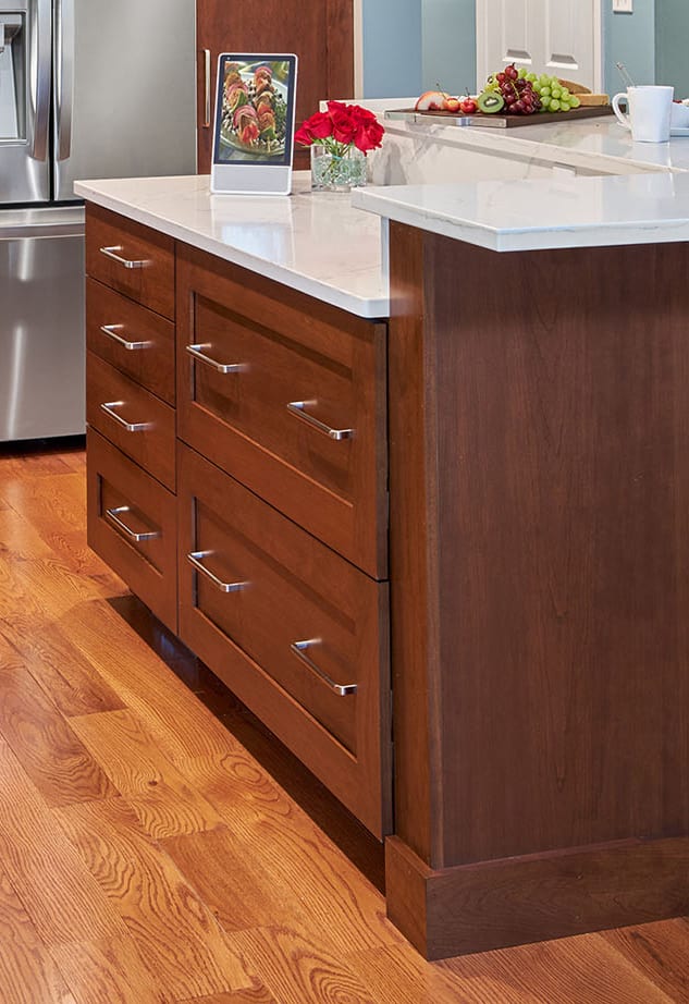
The elimination of the kitchen wall also meant the elimination of a kitchen doorway. This in turn provided an opportunity for a full height, pull-out pantry next to the refrigerator. Pull-outs make efficient use of all of the cabinetry space, allowing items that would otherwise be hidden in the back to be accessed easily.
Finally, the hutch in the dining room provides the perfect storage spot for table linen, good china and special glassware. The glass doors of the backlit upper cabinetry help to highlight wine glasses, wedding gifts and collectibles.
Special Touches and Attention to Detail Make the Space Unique
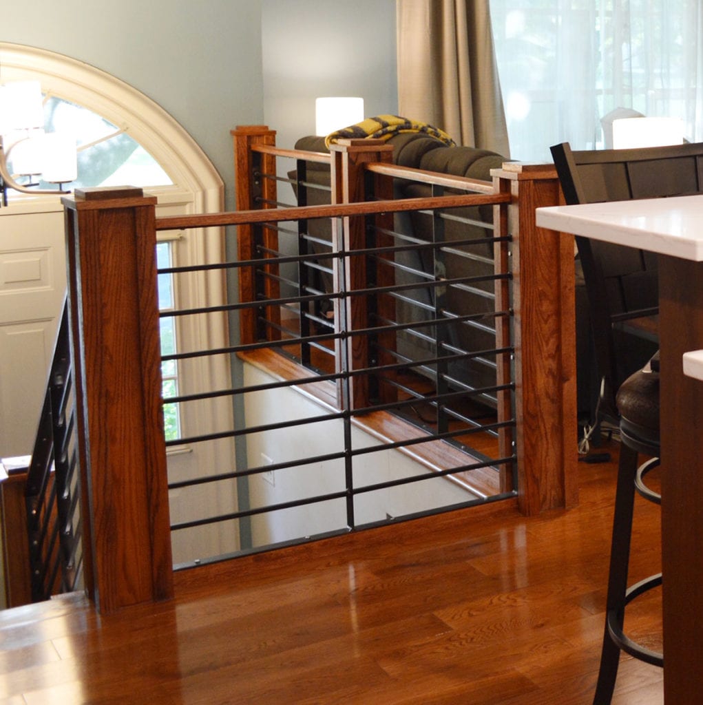
Every homeowner brings something personal and special to a remodeled home and this Mechanicsburg split-level was no different. The husband and his uncle are skilled woodworkers and they fashioned the beautiful cherry wood banisters and metal railings shown in the photo below. Replacing the bland wrought iron railing that existed prior to the renovation, these modern railings enhance the open and airy feel of the renovated main floor while adding a one-of-a-kind detail to the home.
To open up the grand new space to the beautiful views out back we invested in two upgrades that made a big difference. First, we replaced the double-hung kitchen window with a large awning-type window. This type of window eliminates the center mullion that so often blocks the users view, really opening up the space. Second, we replaced the existing sliding door with a unique slider with integrated blinds between the glass. By eliminating the need for window treatments on either side of the sliding door, the room looks both cleaner and brighter.
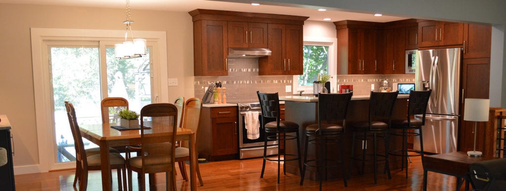
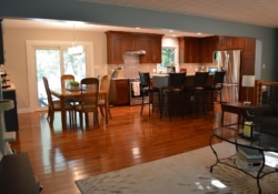
We visually unified the three rooms by installing the same manufactured wood flooring in a continuous plane. The expansive wood floor is softened by throw rugs that not only protect the floor in high traffic areas, but also offer an opportunity to bring in contrasting textures and colors into each space.
Final touches like outlets hidden underneath upper cabinets and LED lighting in the cabinets not only eliminate the design bane of “wall acne” they also add functionality. When coupled with a contrasting manufactured solid surface that needs little to no maintenance, this remodeled kitchen doesn’t just look spectacular, if performs beautifully.
If you’re eyeing a split-level home for renovation or want to pick our brains for ideas on how to remodel your raised ranch home, contact us today. We’d be glad to sit down over a cup of coffee to share our ideas.

